
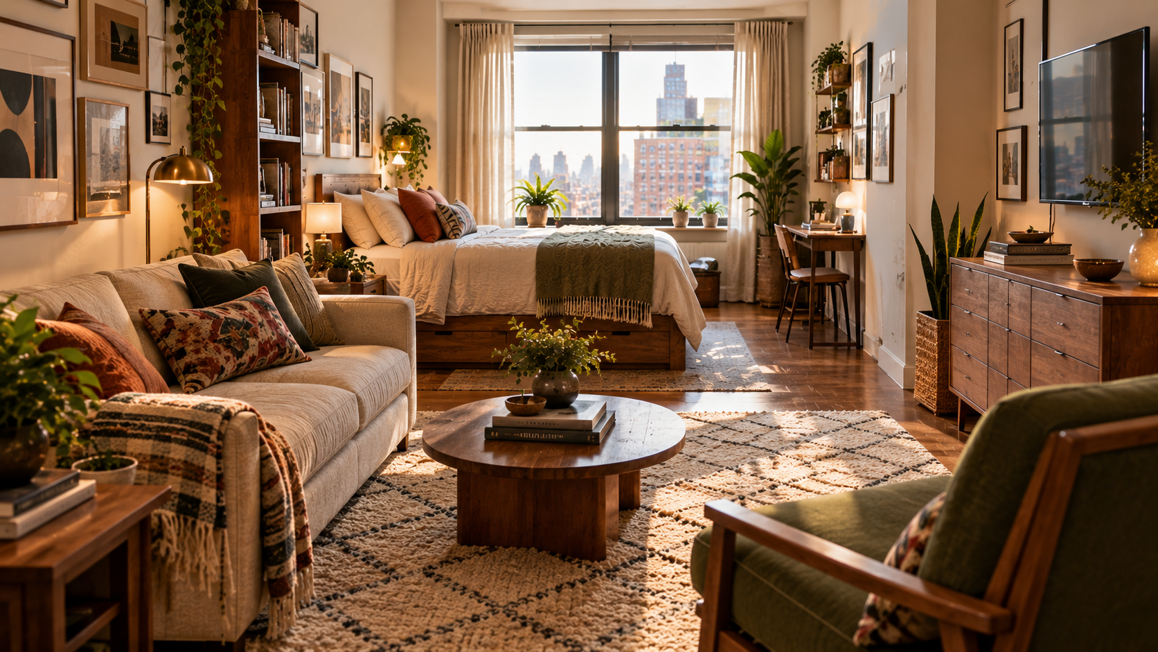
The layout does more work than the decor in a studio apartment — the right arrangement makes one room read as two or three, and the wrong one makes even a large studio feel like a hallway. Here are 15 real layouts, each built around one specific technique for splitting the space.
Which layout technique fits your studio?
| Technique | Zone Marker | Best Room Shape |
|---|---|---|
| Rug-based zoning | Rug pattern/color change | Square or wide rectangle |
| Full-height wardrobe anchor | Furniture placement | Long narrow studio |
| Bookshelf or cube divider | Open shelving | Room with two natural halves |
| Color-block wall | Paint/accent color | Any shape, one strong wall |
| Single-line layout | Everything against one wall | Small or narrow footprint |
1. Open Zone Layout with a Diamond Rug as the Divider
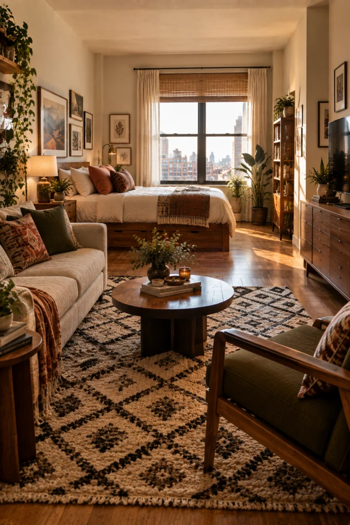
A patterned rug is the single fastest way to define a zone without touching a wall or buying a divider — the eye registers “different room” the moment the flooring pattern changes underfoot. Keep the rug’s boundary a few feet clear of the bed so the two zones don’t visually collide.
Pro tip: An arched floor lamp beside the sofa saves surface space that a table lamp would otherwise take up, and its curved shape adds visual interest overhead instead of on the floor.
2. Bold Yellow Walls with a Compact Dining Corner
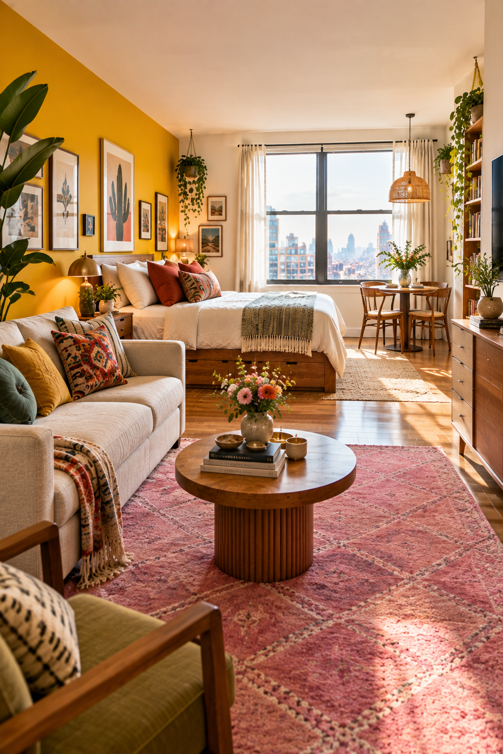
Color can do the same zoning job furniture usually does — a fully committed accent wall behind just one zone (the seating area, not the whole room) tells the eye where that zone starts and ends. Keep the bed and sofa parallel with just enough gap between them to walk through comfortably. For more color-led layouts like this, these functional studio apartment layout ideas for small spaces are worth a look.
My take: Pick one bold wall color and let a single rug repeat it. That repetition, not the wall alone, is what makes the zoning read as intentional.
3. All-White Layout with a Dual Sofa Setup
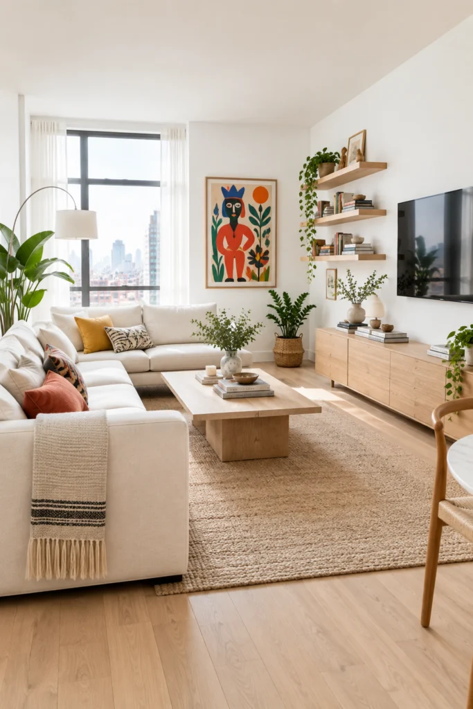
An L-shaped two-sofa arrangement works even in a studio because it faces conversation inward rather than at a wall, which reads as a real living room instead of a waiting area. Mounting the TV instead of using a stand and using floating shelves for storage keeps the floor completely clear around the seating.
Pro tip: Floating shelves above a console hold everything you’d otherwise need a cabinet for, without eating a single square inch of floor space.
4. Parallel Layout with a Full-Height Wardrobe Anchor
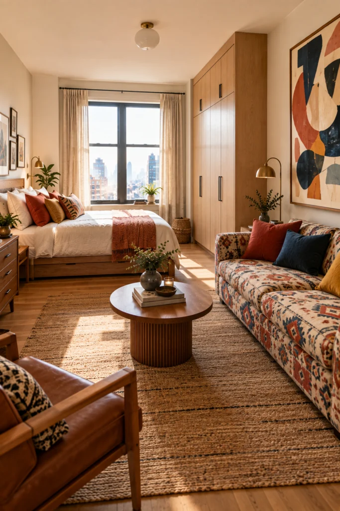
Placing the bed and sofa directly parallel, facing each other, is the simplest layout that still clearly separates two zones — no divider needed when the furniture itself marks the boundary. A full-height wardrobe filling the gap between them earns its footprint three times over: closet, dresser, and visual anchor in one piece.
Pro tip: Hang one large art piece above eye level rather than at eye level — it pulls the gaze upward and makes a low studio ceiling feel taller than it is.
5. Hotel-Suite Layout with a Statement Chandelier
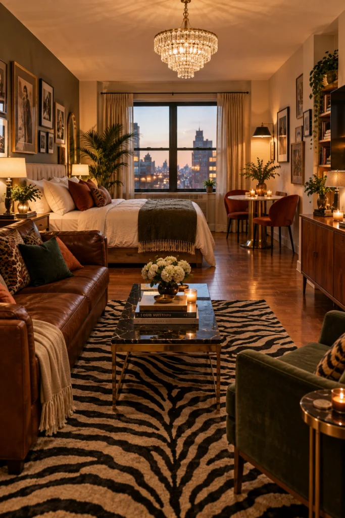
Running the sofa perpendicular to the bed — rather than parallel or facing it — creates a clean L-shaped boundary between sleeping and living zones using only furniture placement. A single statement chandelier overhead visually unifies all three functions (sleeping, sitting, dining) under one light source, which reads as one considered room instead of three separate purchases.
Pro tip: Wall-mounting the TV is close to non-negotiable in a layout this dense — every inch of surface space is already spoken for.
6. Studio with a Dedicated Work-From-Home Zone
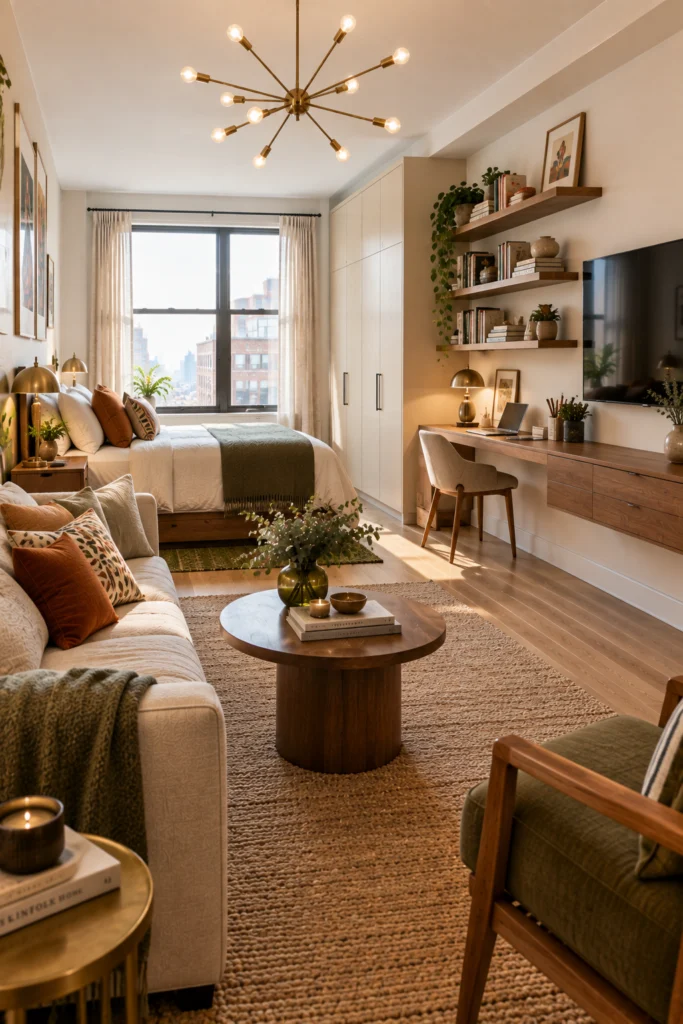
A studio can hold three functional zones, not just two, as long as each one gets a clear boundary — here, the desk wall, the sofa, and the bed each claim their own third of the room. A single overhead fixture, like a sputnik light, visually unifies all three zones even though they serve completely different purposes.
Renter-friendly alternative: Command hooks and floating wall-mounted shelving add this much function without putting a single hole in a wall you don’t own.
7. Romantic Layout with a Mural Wall as the Anchor
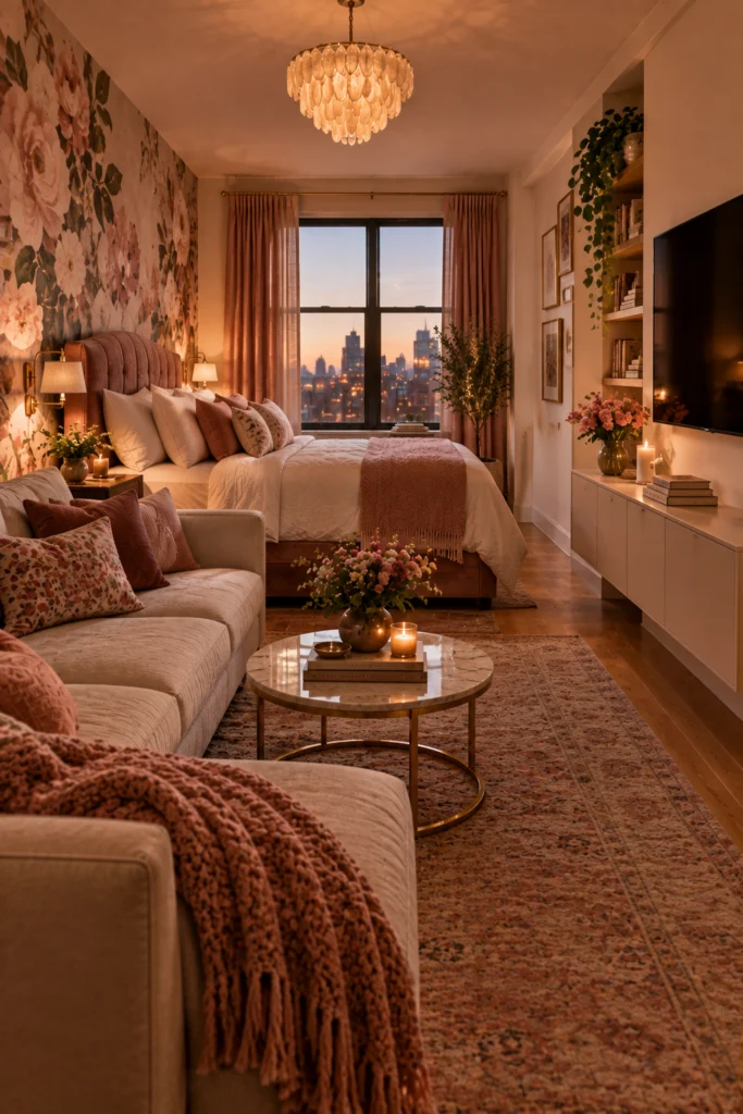
A mural or wallpaper panel behind the bed does double duty as headboard and artwork, which matters when a studio doesn’t have room for both separately. Letting the bed frame jut slightly into the room, with a sectional running alongside it, creates a physical border between sleeping and lounging without a single divider object.
My take: One bold romantic gesture — the mural — is enough. Keep every other color choice in the room quiet so it doesn’t compete.
8. Cozy Layout with a Damask Accent Wall
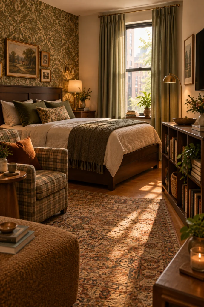
Patterned wallpaper on a single wall makes a small space feel finished rather than half-decorated, especially when it’s confined to just the wall behind the bed. A compact armchair and side table placed in the remaining corner create a reading nook using furniture that would otherwise sit unused.
Pro tip: Every piece in a studio should pull double duty — a storage cube that’s also a bookshelf and photo display is the rule that separates a good layout from a great one.
9. Studio with a Tall Bookshelf as a Room Divider
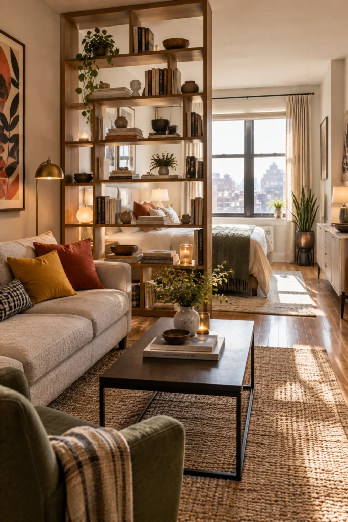
An open-back bookshelf splits a studio into a distinct “bedroom” and “living room” while still letting light and sightlines pass through — a solid divider would block both. Positioning the bed directly behind it and the sofa directly in front makes the zoning immediately obvious from the doorway.
Pro tip: Open-back shelves work better than solid dividers in a small room specifically because they don’t make the space feel smaller than it already is.
10. Cube Shelf Divider with a Statement Green Sofa
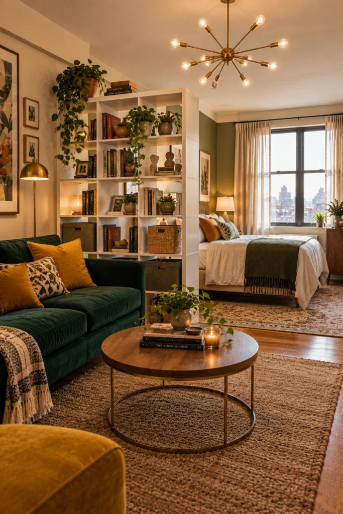
Turning a cube shelving unit sideways so it functions as a divider — not just storage against a wall — defines the bed area without blocking a single ray of light through the open cubes. An emerald sofa facing it gives the living side a clear focal point strong enough to balance the shelving’s visual weight.
My take: Same zoning logic as an open bookshelf, but with a lot more built-in storage — every cube holds something instead of standing empty.
11. Open Studio with a Teal Accent Wall Doing the Zoning
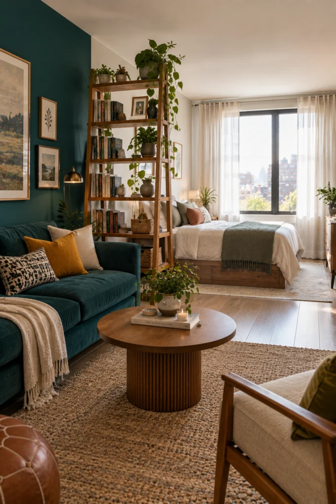
Skipping a physical divider entirely and relying on one accent wall color plus a low ladder shelf works well for anyone who wants defined zones without ever feeling boxed in. The teal wall claims the living half of the room on its own; the ladder shelf adds just enough visual separation on the bed side without blocking the window light.
Pro tip: This layout works best when the accent wall and the bed sit on opposite ends of the room — if they’re adjacent, the color zoning reads confused instead of clear.
12. Feminine Layout with a Carved Folding Screen
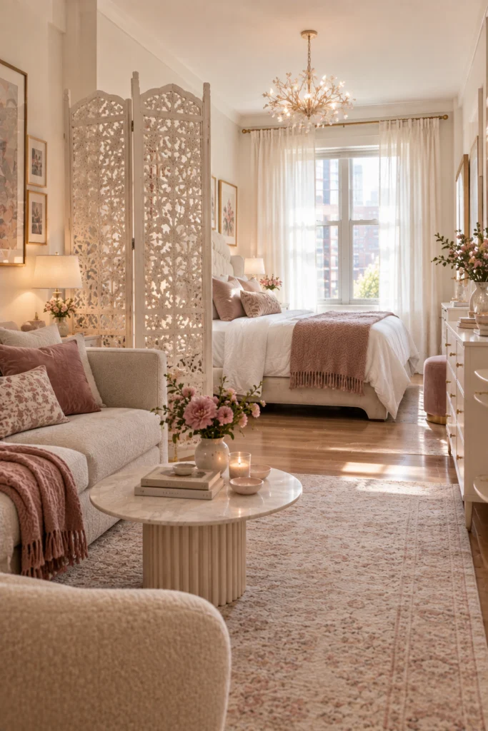
A folding screen is the only divider on this list you can fold flat in thirty seconds when you want the whole studio open again — genuinely useful if you host or just want the space to feel different on weekends. Keeping the palette entirely soft (white and dusty rose) means the screen’s carved detail becomes the room’s main textural interest.
Renter-friendly alternative: No drilling, no wall damage, and it moves with you — a folding screen is one of the few dividers that’s a piece of furniture, not an installation.
13. Compact Studio with a Full Dining Table
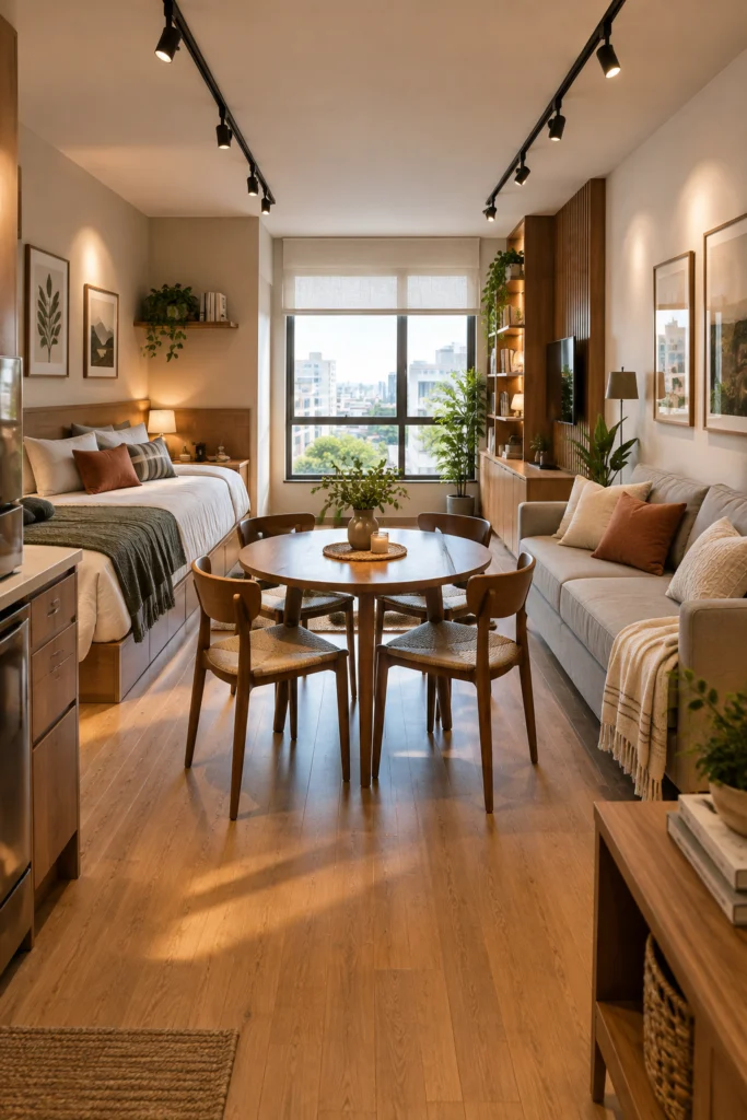
A full dining table fits in a studio when it’s round rather than rectangular — a round table loses the corners that eat into walkway space while still seating the same number of people. Track lighting overhead lets each zone (dining, sleeping, seating) get brightened independently instead of relying on one flat overhead wash of light.
I’ve tested this: A round table beats a rectangular one in a studio every time — you gain the flow back and lose nothing in seating capacity. For more small-footprint furniture picks like this, these space-saving studio apartment furniture ideas cover the same ground.
14. Cube Divider with Hidden Basket Storage
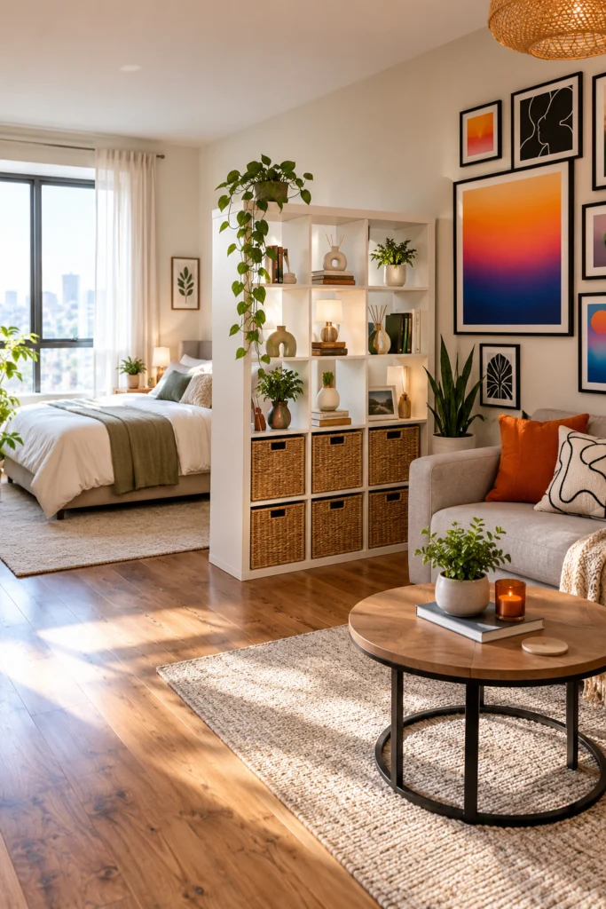
Adding woven baskets to the lower cubes of a shelf divider hides the genuinely unglamorous stuff — cables, mail, spare linens — while keeping the open upper cubes for styled objects. This is the layout to copy if you want a divider that’s functional and photogenic in equal measure rather than choosing one over the other.
Pro tip: Keep baskets confined to the bottom row only; if they climb higher, the divider starts functioning as a solid wall and blocks the light it’s meant to let through.
15. Efficient Line Layout with a Hotel-Style Feel
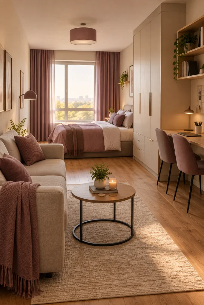
Running every major piece — bed, wardrobe, desk — along a single wall is often the layout people overlook because it sounds too plain, but it opens up more clear floor space than almost any other arrangement on this list. The sofa facing the line from the opposite wall gives the room a second focal point without crowding the main furniture run. For more layouts built around keeping floor space genuinely open, these open concept studio apartment ideas take the same approach further.
My take: Sometimes the boring layout wins. A single clean line against one wall feels calm every time you walk in, and that’s worth more than a clever divider most days.
Common studio layout mistakes to avoid
- Placing furniture that blocks the main walkway. Leave at least 30 inches of clear path between the bed and any seating.
- Using a solid divider instead of an open one. A closed wardrobe or panel blocks light two directions; an open shelf blocks it in neither.
- Skipping a zone marker entirely. Even a rug or a single accent wall reads as a boundary — going with no marker at all makes the whole studio feel like one undefined room. These studio apartment divider ideas for small spaces cover more options if a rug alone isn’t enough.
- Choosing a rectangular dining table over a round one when space is tight. The corners of a rectangular table eat into walkway space a round table doesn’t need.
- Forgetting that furniture placement alone can zone a room. Not every layout needs a physical divider — parallel or perpendicular placement does the job in several of the layouts above. For more layout inspiration overall, see these best studio apartment layout ideas.
Quick answers
What’s the best way to divide a studio apartment without a physical wall?
Furniture placement (parallel or perpendicular arrangement), a rug, or an open shelving unit all define zones effectively without a solid wall.
Does a round or rectangular dining table work better in a small studio?
Round tables generally work better — they seat the same number of people as a rectangular table but lose the corners that eat into walkway space.
Can color alone zone a studio apartment?
Yes — a fully committed accent wall behind just one zone tells the eye where that zone starts and ends, without any furniture or divider needed.
Is a folding screen a good studio apartment divider?
Yes, especially for renters — it adds no wall damage and can be folded flat in seconds when you want the room fully open again.
How do I fit a work-from-home zone into a studio layout?
A floating desk along one wall with a mounted TV above it and open shelving keeps a work zone contained without taking up floor space a dresser or table would need.
What’s the most space-efficient studio layout overall?
Running major furniture pieces in a single line against one wall, with seating facing them from the opposite side, tends to open up the most usable floor space.
The layout change that surprised me most in my own studio was moving the sofa to face the bed instead of the wall — same furniture, same room, but it suddenly read as two separate spaces instead of one crowded one.