
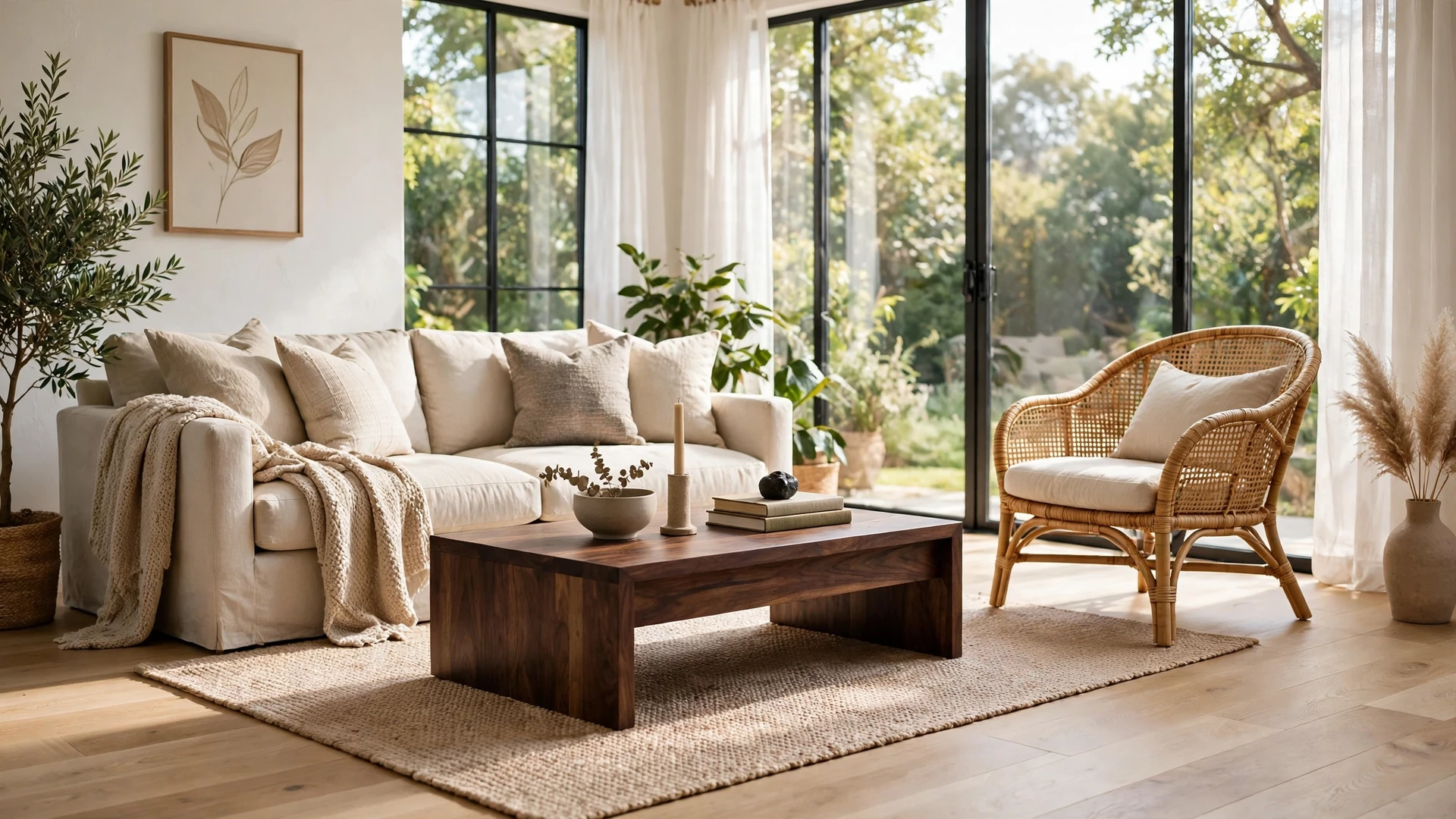
Most people are told never to mix wood tones, then look around their own home and realise they already have: the floor is one wood, the table another, the shelves a third. Mixing wood is not the problem — mixing it without a plan is. This guide gives you the plan: one rule, one quick test, and a limit that keeps any room looking deliberate instead of accidental.
The One Rule: Pick a Dominant Wood and Let the Rest Support It

Every room that mixes wood well has one wood doing most of the work and the others playing smaller parts. Choose the dominant wood first — easiest is to look at what you already have the most of, which in most rooms is the floor. Oak floor, oak is dominant; dark walnut floor, walnut is. Everything else should support it, not compete with it.
Aim for roughly 70 percent dominant wood, 20 percent a second wood, and 10 percent a third if you want one at all. The dominant wood appears in the biggest pieces — the floor, the largest furniture, the dining table. The second wood appears in one or two medium pieces, like a coffee table or chairs. The third wood belongs only in small accents: a frame, a bowl, a tray.
The dominant wood also sets the mood: light oak feels airy and casual, mid-tone walnut warm and grown-up, dark mahogany formal and heavy. Before you buy anything new, name your dominant wood out loud and check every piece against it. If a piece does not work with it, it does not belong in the room, no matter how much you like it on its own.
Do not try to match your furniture exactly to the floor: the same tone blends into it and makes the room look flat, while a second wood a few shades lighter or darker gives it depth. For more on building a room around one strong material, see How to Make Your Studio Apartment Look Expensive.
Warm vs Cool Undertones — How to Tell Them Apart in 10 Seconds
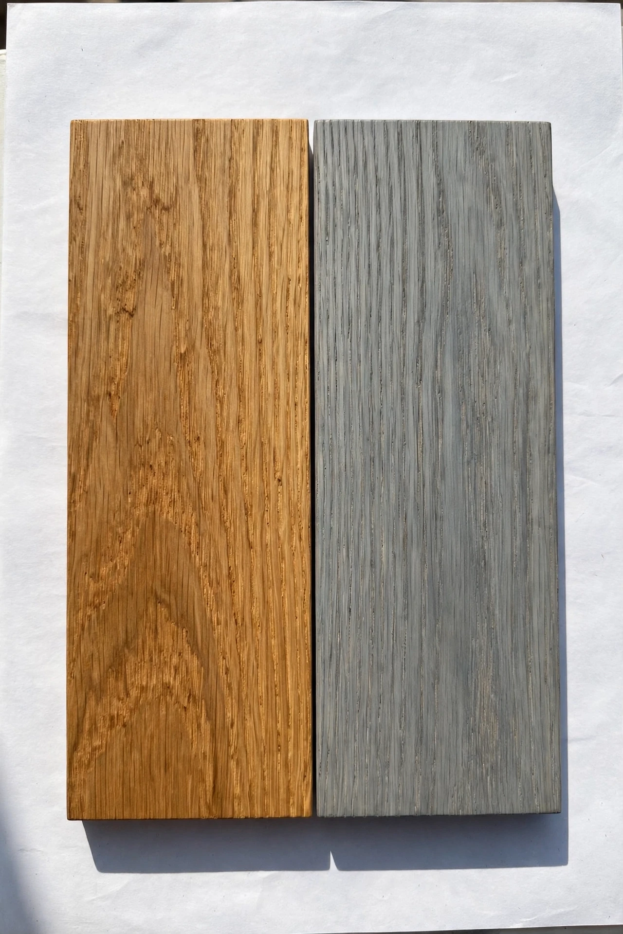
Mixed wood goes wrong because of the undertone, almost never the species: wood is warm or cool, and warm and cool woods fight each other even at the same shade.
Warm woods have yellow, orange, or red underneath: oak, pine, cherry, mahogany, most walnut. Cool woods have grey, ash, or blue underneath: weathered grey oak, ash, ebonised wood, driftwood finishes. Two warm woods almost always work together, even if one is light and one is dark, and two cool woods work together too. One warm and one cool wood in the same room is what looks wrong — and people usually blame the size or the style, when it is the undertone.
Here is the 10-second test. Hold the two pieces next to each other in daylight, or a sample of each against a plain white sheet of paper, and look at what color sits behind the wood. Both lean yellow or red? Warm. Both lean grey or blue? Cool. One leans yellow and the other grey? Do not put them together unless one is very small — a frame or a tray can break the rule, too small to set a tone.
The test also works on finishes. A "natural oak" floor and a "honey oak" table are both warm and will work together; a "grey-washed oak" floor and a honey oak table will not, though both are called oak. When shopping, ask for the undertone, not just the wood name, and test every new piece against the dominant wood first.
How Many Wood Tones Are Too Many (the 3-Tone Limit)

Three is the limit for most rooms. One wood can look flat and matchy; two look intentional; three look collected. Four or more almost always look like a mistake, because the eye cannot find a pattern and stops trying.
The limit counts distinct tones, not pieces. Ten oak pieces in one tone count as one wood; one oak floor, one walnut table, and one dark shelf count as three. Small accents do not count if genuinely small — a bowl, a frame, a candle holder — but a bookshelf, chair, or side table always counts, big enough to read as a wood tone.
If you are already over the limit, do not throw furniture away. Reduce the tones the eye sees: paint or stain the smallest offender to match one of the other woods, or cover it — a tablecloth on a clashing table, a throw over a chair back, books stacked on a shelf. Or move the worst offender to another room. The goal is three tones the eye can read as a pattern.
Small rooms should aim even lower. In a studio or small living room, two woods are often better than three — less space for the pattern to establish itself. A dominant wood and one supporting wood, repeated a few times each, looks more deliberate than three woods fighting for attention in 20 square meters. For ideas on keeping a small room calm with fewer materials, see How to Make Your Studio Apartment Look Aesthetic.
Mixing Wood with Black Metal, Brass and Rattan

Other materials make mixed wood look intentional, because they break it up and give the eye something else to look at.
Black metal is the most useful partner. A black frame on a wooden table, black chair legs, or black handles on wooden doors all sharpen the wood and make the tones look deliberate. It works with warm and cool woods, the safest bridge when you have one of each you cannot change: a few pieces between them stop the two woods from arguing.
Brass does the same job in a warmer way. It suits warm woods best — oak, walnut, cherry — and adds a small shine that stops a room full of wood from looking flat. Use it sparingly — a lamp base, a few frames, a side table. Too much turns a room brassy, and next to cool grey wood it looks out of place.
Rattan and cane soften everything. A rattan chair next to a dark wood table, or a woven basket under a light wood shelf, adds texture that makes the wood tones matter less. Pale and neutral, rattan works with warm and cool woods alike, and it is the best material for small rooms where a third wood would be too much — an accent gives you a third material without a fourth wood tone.
Repeat each material at least twice: one black metal piece looks like an accident, two look like a choice.
Floors vs Furniture: When They Should Match and When They Should Not

The floor is the biggest wood surface in the room, so it sets the rules: whether furniture should match it or contrast with it depends on the floor.
If your floor is mid-tone — natural oak, medium walnut — your furniture should contrast with it, clearly lighter or darker. The same tone disappears into the floor and the room loses depth. A light oak floor with a walnut table, or a walnut floor with a pale ash coffee table, gives the room a shape the eye can follow. Aim for a few shades of difference, enough to tell floor from furniture at a glance.
If your floor is very light — pale ash, whitewashed pine — almost any furniture wood works, because it reads as neutral. Dark furniture looks striking against it, light furniture calm. The risk is the room looking washed out, so a darker piece or two gives it weight.
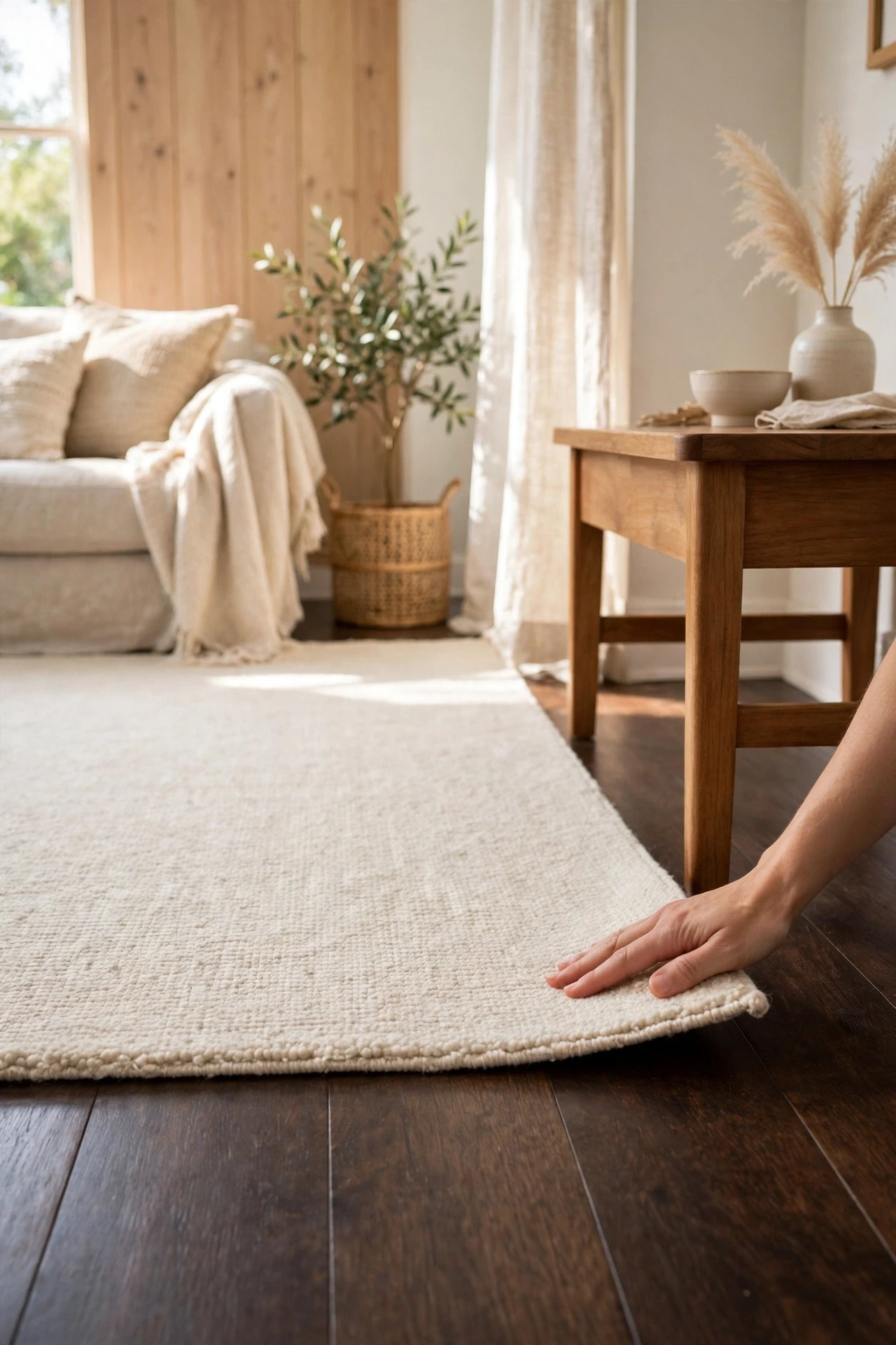
If your floor is very dark — espresso, ebonised wood — keep your furniture lighter. Dark on dark makes the bottom half of the room disappear, and the room feels smaller and heavier. A light oak or ash table lifts the whole room, and a pale rug between them helps.
One exception: dining sets. A table and its chairs in matching wood look right, because they read as one piece of furniture, and a matching set on a contrasting floor is fine. For more on choosing furniture that earns its place, see What Furniture Works Best in a Studio Apartment.
Small-Room Examples: Oak + Walnut, Pine + Dark Wood

Theory is useful, but examples are better. Here are two combinations that work in small rooms.
Oak and walnut is the most reliable pairing there is. Light oak floors with a walnut coffee table and walnut-framed chairs give warmth without darkness, and the contrast reads clearly but feels calm. Keep the walnut to the furniture and let the oak own the floor and larger surfaces. Add black metal legs or handles to bridge the two, and a pale rug to keep the floor from dominating. This is the pairing I recommend if you are starting from scratch.
Pine and dark wood is trickier, and it works because of contrast. Pine is pale, yellow, and casual; a dark wood like mahogany or espresso-stained beech is formal and heavy. Together they can look like a country cottage done well, or like two different rooms pushed together. The difference is proportion: keep the pine to one thing — the floor, or a single large piece — and the dark wood to one or two pieces, then add a third material, black metal or rattan, between them. Without it, pine and dark wood argue; with it, they look like a deliberate contrast.
Quick Fixes If It Already Looks Wrong
First, find the worst offender. Stand in the doorway and look for the piece that draws your eye for the wrong reason — usually the one whose undertone clashes with the dominant wood, or the one that adds a fourth tone. Move it out, even temporarily, and see if the room settles. Nine times out of ten, removing one piece fixes the whole room.
Second, break up direct contact. Two clashing woods look worse when they touch. A rug between floor and table, a runner under a sideboard, or a tray on a table puts a layer between two tones that do not get along — it just has to break the line where they meet.
Third, repeat the odd one out. One walnut piece in an oak room looks lonely — add one more small walnut thing, a frame, a bowl, a bookend. One looks like a mistake; two look like a choice. The fastest fix there is, and it costs almost nothing.
Fourth, change the finish instead of the furniture. A light sand and a new stain can turn a clashing side table into a matching one in an afternoon, and paint can do the same for a bookshelf. Stain when the grain is worth showing; paint when it is plain or damaged. Changing one small piece is cheaper and faster than replacing it.
If none of that works, the problem may be the light, not the wood. Warm bulbs make warm woods richer and cool woods muddy; cool bulbs do the opposite. Check your bulbs before you blame your furniture — a room that looks wrong under cool white light can look right under warm 2700K light.
Quick Answers
Can I mix oak and walnut in the same room? Yes, one of the most reliable. Oak is light and walnut dark, both warm-toned, and the contrast reads as deliberate. Keep the oak dominant and the walnut to one or two furniture pieces.
How do I tell if a wood is warm or cool? Hold it against a plain white sheet of paper in daylight. Yellow, orange, or red behind the wood means warm; grey or blue means cool. Warm with warm and cool with cool works; warm with cool looks wrong.
Is it OK to have different wood tones in the kitchen and the living room? Yes, if the rooms are genuinely separate — the limit applies per room, not per home. In an open-plan space, though, kitchen and living area are one room, so count them together.
My floor is dark and my furniture is dark. What do I do? Lighten the middle layer. A pale rug, light cushions, or a light wood coffee table between dark floor and dark furniture will lift the room. If you can only change one thing, change the rug — it covers the most floor for the least money.
Can I mix wood furniture with a wood-look floor? Yes, the same rules apply. A wood-look floor still has a tone and an undertone, so treat it like real wood: name it as your dominant wood and contrast your furniture with it.
Final Thoughts
Mixing wood tones is not a talent, it is a method. Name the dominant wood, check the undertones with the white-paper test, keep it to three tones, and repeat each material at least twice. Do that and the room will look collected on purpose, not assembled by accident. And if it still looks wrong, remove one piece before you buy anything — the answer is usually subtraction, not addition.

Hi, I'm Wasif — welcome to The Homes Decors. I write about home decor: the ideas, choices, and small details that make a space feel considered rather than accidental. If you've ever wondered why a room works, not just what's in it, you're in the right place.