
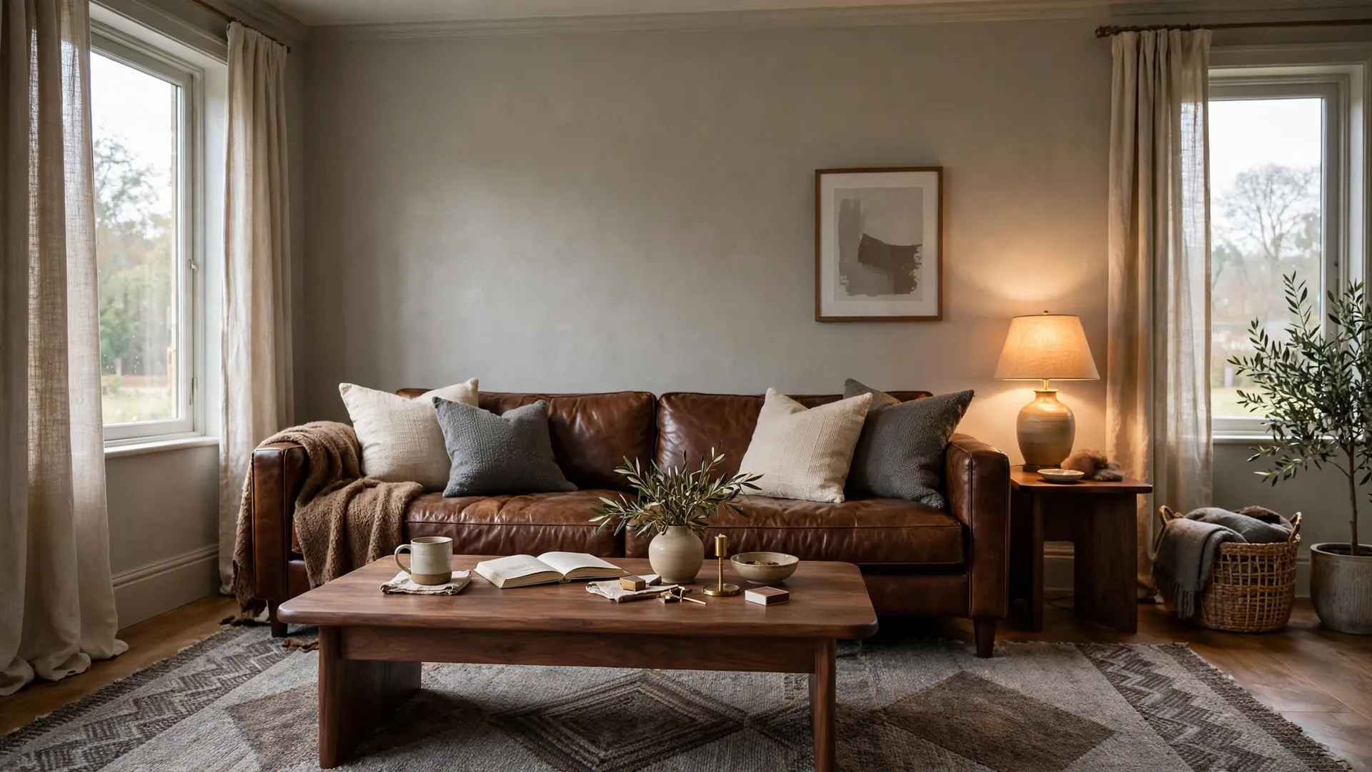
A warm brown and grey palette uses one grey base, one or two browns and a small accent, in roughly a 60-30-10 balance. Add warm lighting and texture. These 20 palettes give exact combinations, with tips and answers.
Brown and grey work because one is warm and one is cool, so each balances the other. The hard part is choosing the right shades and the right proportions. Each palette below names the colors first, then shows how to use them. If you want more layouts to match, these brown and grey living room ideas are a good place to browse.
1. Warm grey, chocolate brown and cream
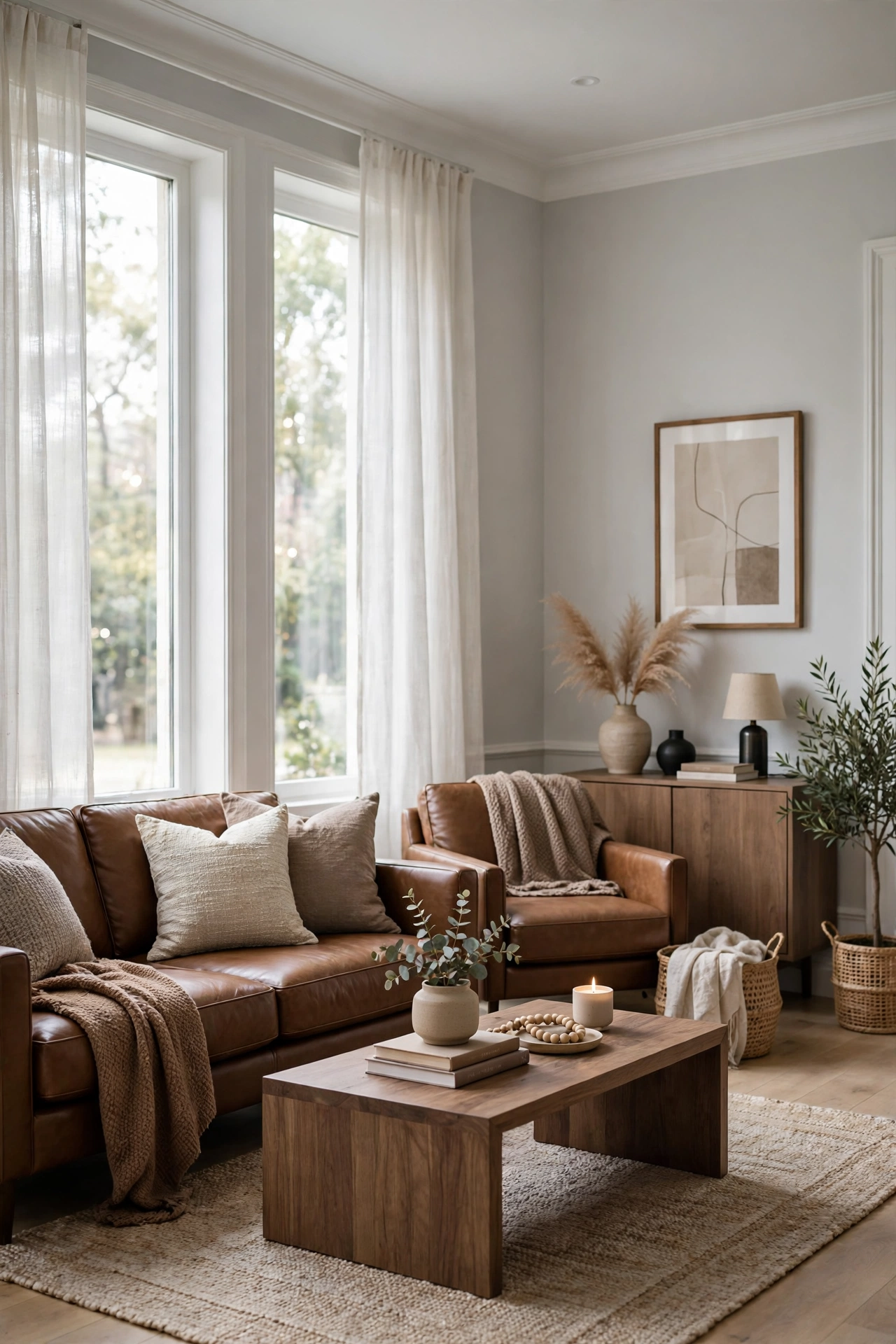
This palette uses warm grey on the walls, chocolate brown in the sofa and cream in the textiles. It is the safest warm combination, because cream bridges the two colors. Keep grey as the largest share, and let brown appear in two or three big pieces. Add cream pillows and a cream rug to lift the darker brown. The room feels calm, rich and easy to live with.
Pro tip: Choose a grey with a slight beige undertone, since a blue-leaning grey can make chocolate brown look heavy.
2. Greige walls, walnut and black accents
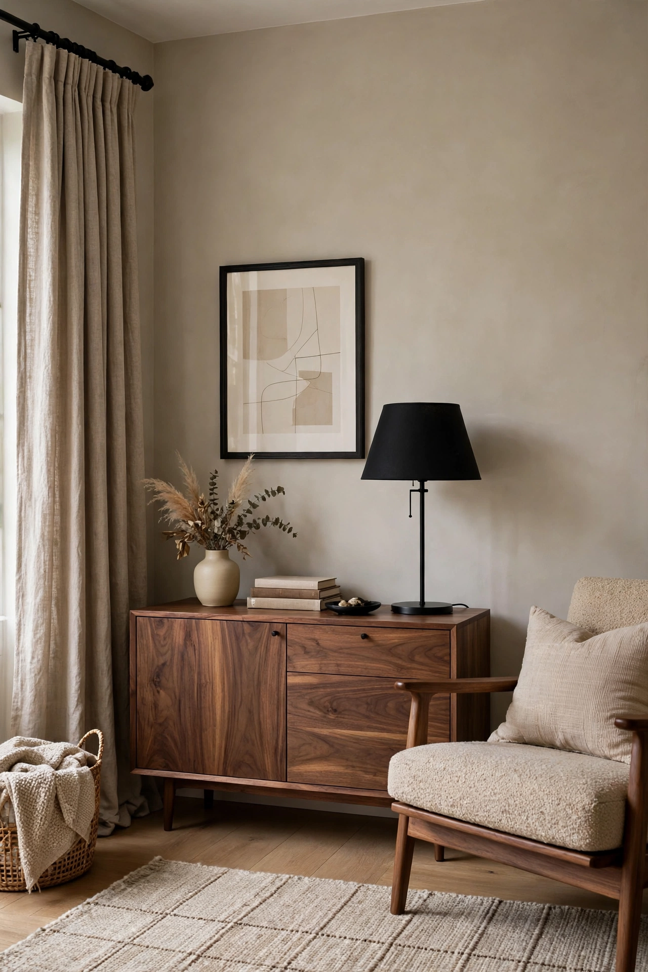
This palette combines greige walls, walnut wood and black accents. The greige sits between brown and grey, so it blends both without effort. Walnut furniture brings a rich brown, and black adds a modern edge. Use black in small doses, such as a lamp, a frame and a curtain rod. The result looks clean and slightly modern rather than rustic.
Pro tip: Repeat black at least three times in the room so it looks planned and not random.
3. Charcoal, caramel leather and cream
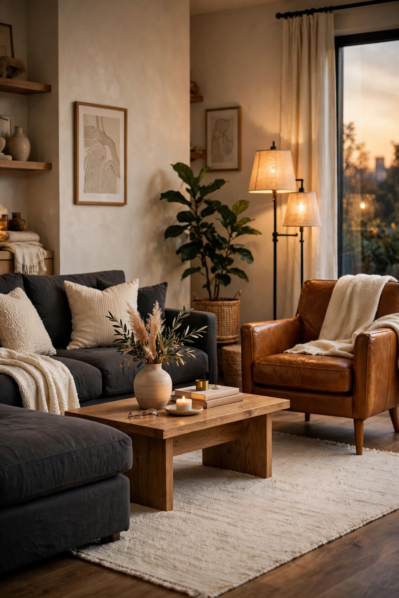
This palette pairs charcoal grey with caramel leather and cream accents. The dark grey gives depth, while caramel leather warms it up. Cream keeps the room from feeling heavy, so use it on a rug and in a throw. A charcoal sofa with a caramel leather chair is a simple way to start. Leather also looks better with age.
Pro tip: Add layered lighting, since charcoal absorbs light, and use warm bulbs around 2700K.
4. Light grey, mocha and white

This palette uses light grey walls, mocha brown furniture and white trim. It is airy and clean, so it suits smaller rooms. Mocha is softer than chocolate, so it does not weigh the room down. White trim and white ceiling add brightness. Keep the accessories simple, with linen and wood. For another soft pairing, see these gray and beige living room ideas.
Pro tip: Paint the ceiling white or a shade lighter than the walls, so the room feels taller.
5. Taupe, slate grey and espresso
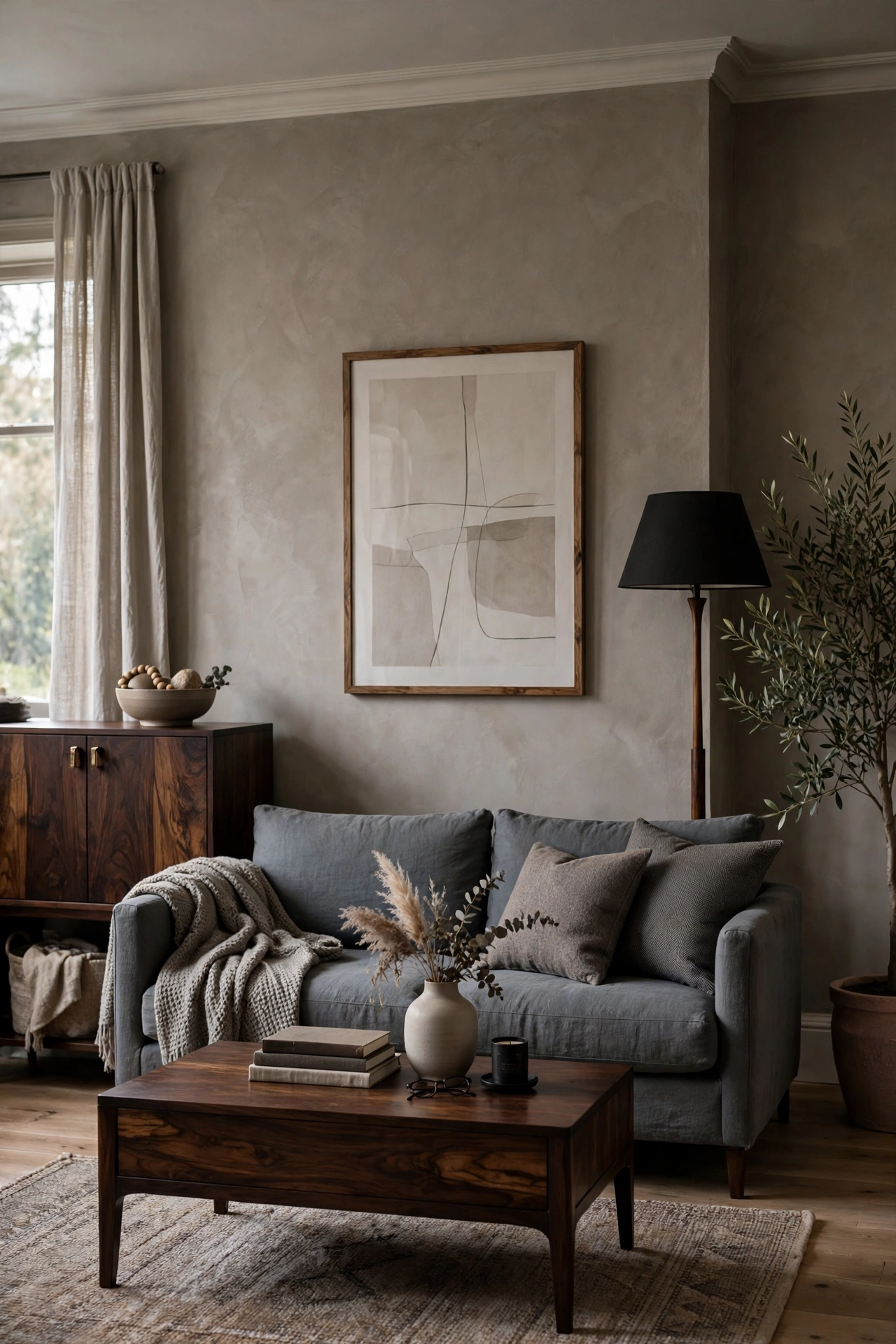
This palette layers taupe, slate grey and espresso brown. All three are muted, so the room feels sophisticated and quiet. Taupe on the walls, slate grey on the sofa and espresso in the wood pieces work well. Add one light element, such as a cream lamp shade, so the palette does not feel flat. It suits a modern or transitional room.
Pro tip: Vary the textures, such as linen, wool and polished wood, since similar colors need texture to look interesting.
6. Grey, cognac and brass

This palette matches grey with cognac leather and brass accents. Cognac is a warm reddish brown, and brass adds a soft metallic glow. Use brass in lamps, frames and a coffee table base. The combination feels classic and slightly luxurious. Keep the grey calm and the brass limited.
Pro tip: Choose brushed or aged brass over bright polished brass, since it looks softer next to leather.
7. Dove grey, chestnut and sage
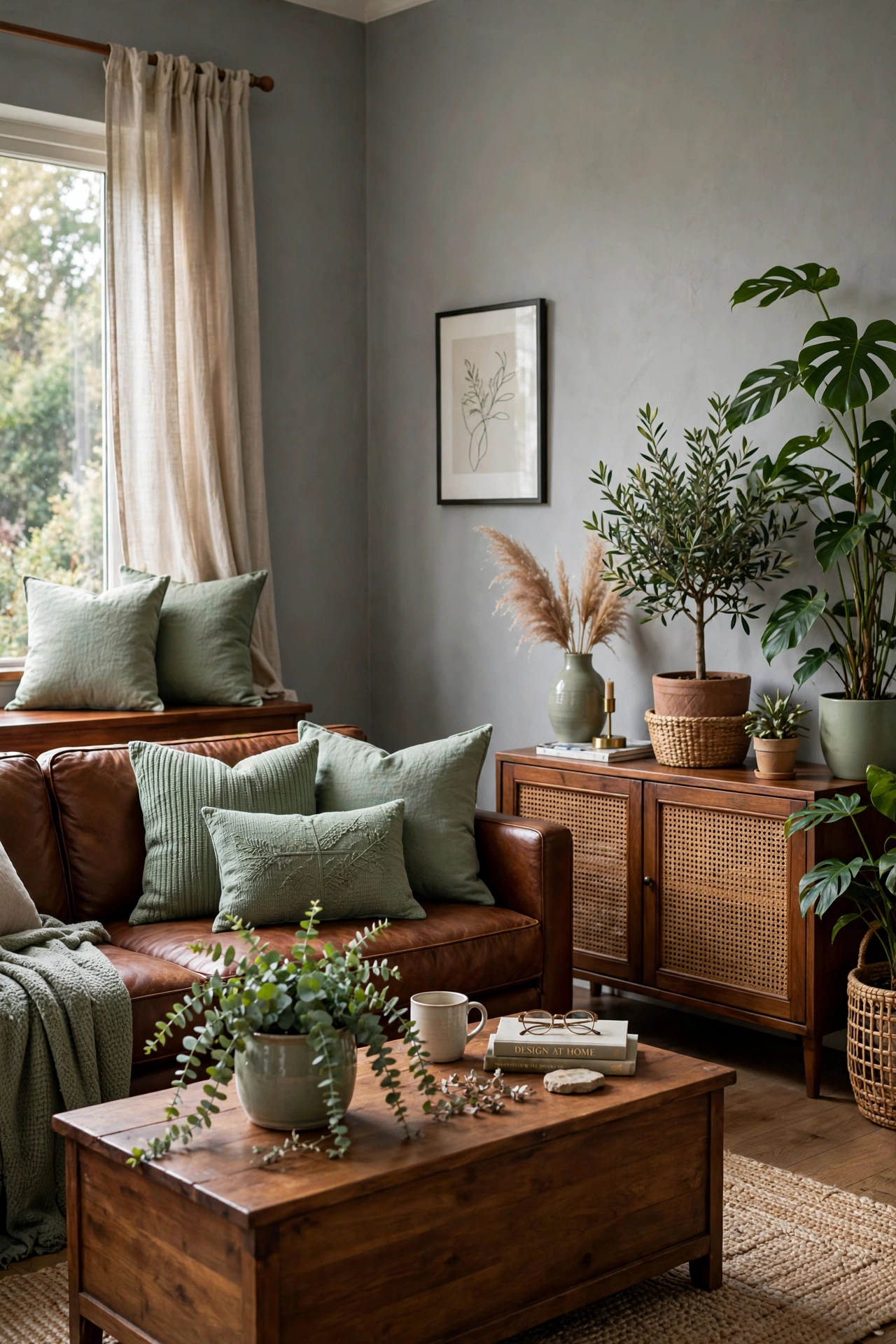
This palette adds sage green to dove grey and chestnut brown. Sage is a muted green that looks natural next to wood. Use it on pillows, a plant or a painted cabinet. The room feels fresh and earthy, with the grey keeping it calm. For more of this green, see these sage green living room decor ideas.
Pro tip: Keep sage to about 10 percent of the room, and repeat it in two or three spots.
8. Grey, brown and rust
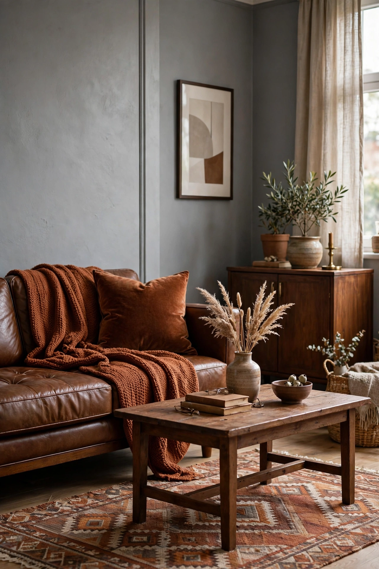
This palette adds rust to grey and brown. Rust is a warm orange-brown, so it deepens the warmth without clashing. Use it in a throw, a rug or a velvet pillow. The grey keeps the rust from feeling too bold. For a stronger version, see these burnt orange sofa living room ideas.
Pro tip: Pick a rust with a brown undertone, not a bright orange one, so it sits well with wood.
9. Grey, brown and navy
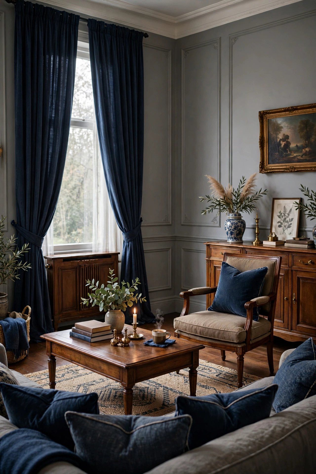
This palette adds navy to grey and brown. Navy is a cool, deep color that makes brown wood look richer. Use it in curtains, pillows or art. The grey keeps the three colors from feeling heavy. The result is classic and tailored.
Pro tip: Choose a navy with a slightly grey undertone, so it blends with the grey base instead of standing apart.
10. Silver grey, coffee and blush
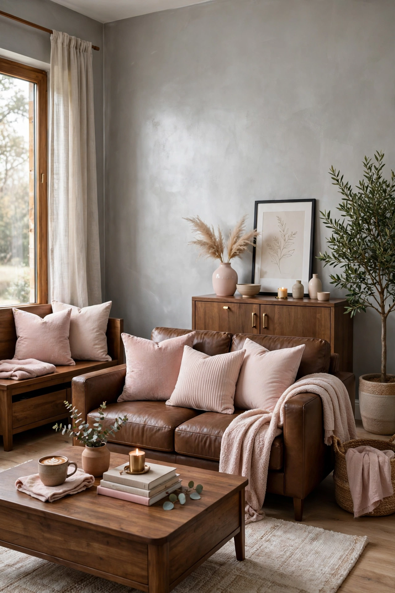
This palette softens brown and grey with blush pink. Silver grey walls, coffee brown furniture and blush pillows feel gentle and warm. Blush adds a quiet romantic note without making the room feel sweet. Use it in two or three small items. It works well in a calm, feminine living room.
Pro tip: Choose a dusty blush with a hint of beige, so it pairs with brown instead of looking bright pink.
11. Stone grey, oak and olive
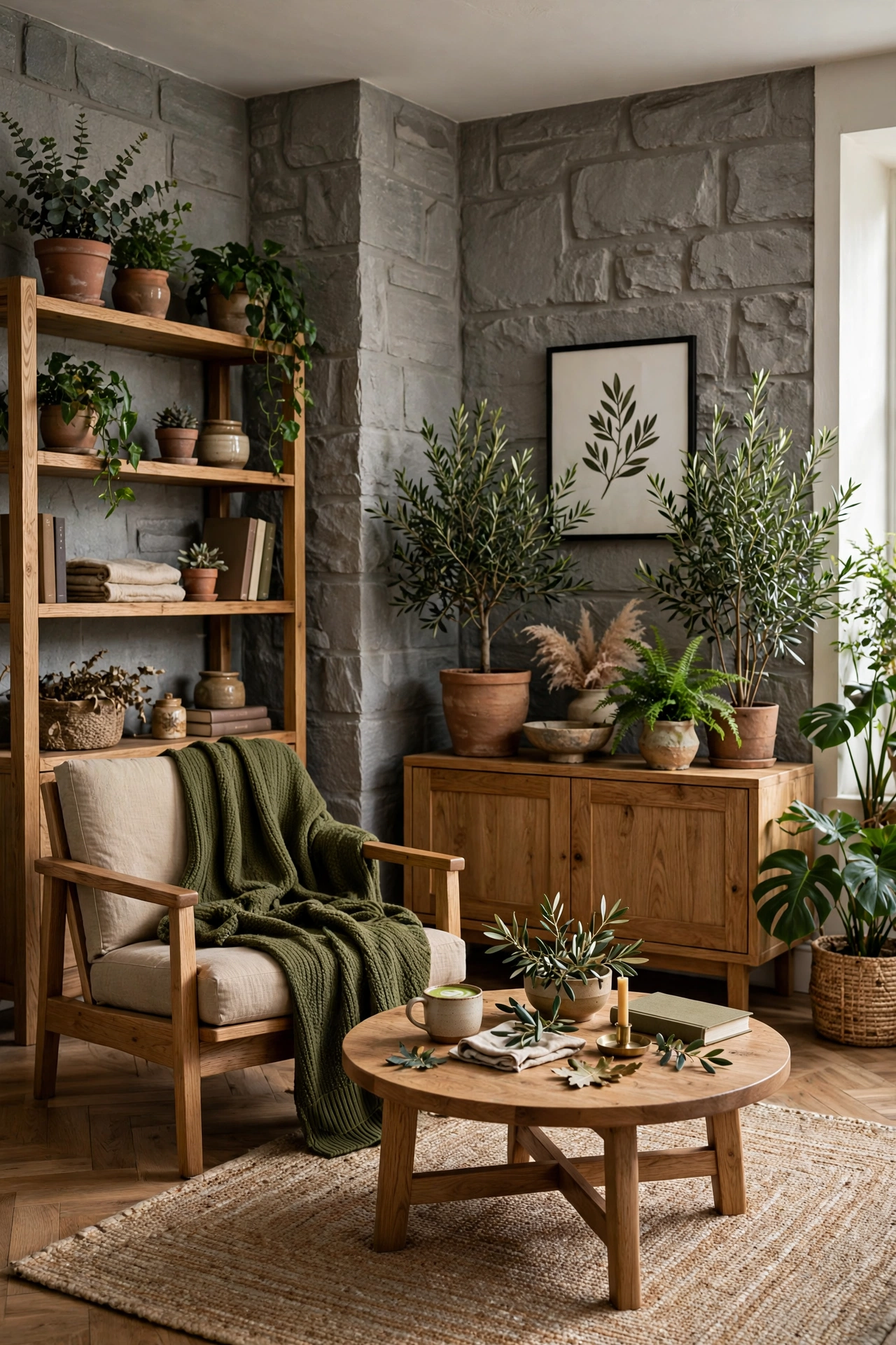
This palette combines stone grey with oak and olive green. The oak is a light, golden brown, which keeps the room bright. Olive adds depth and a natural feel. Use olive in a plant, a throw or a ceramic. The palette suits a modern earthy room. For more ideas, see these modern earthy living room ideas.
Pro tip: Use real plants or textured greens, since natural variation makes olive look richer.
12. Charcoal, chocolate and gold
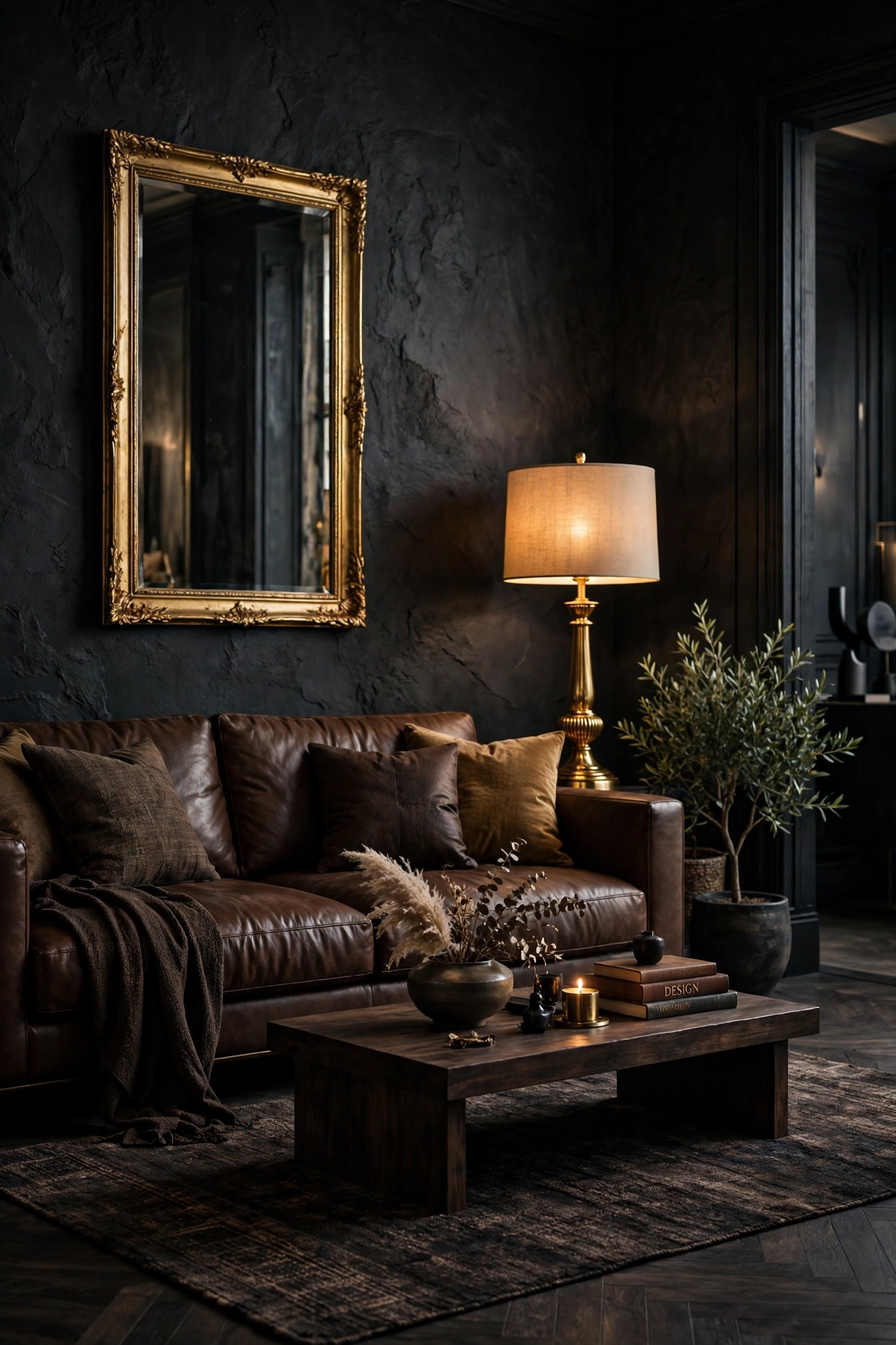
This palette is dark and rich, with charcoal, chocolate brown and gold. Gold adds a warm glow against the dark colors. Use it in a lamp, a mirror frame and small accessories. The room feels dramatic and cozy at night. It suits a larger living room with good lighting.
Pro tip: Use warm bulbs and several light sources, since dark colors need extra light to avoid feeling heavy.
13. Pale grey, tan and terracotta

This palette uses pale grey, tan and terracotta. Tan is a light brown that keeps the room soft, and terracotta adds earthy warmth. Use terracotta in pots, pillows or a rug. The colors feel sunny and relaxed. It suits a room with plenty of daylight.
Pro tip: Choose terracotta in a matte finish, since glossy pots can look harsh in soft light.
14. Grey, brown and dusty blue

This palette adds dusty blue to grey and brown. Dusty blue is soft and slightly grey, so it blends with both main colors. Use it in pillows, curtains or art. The blue cools the room just enough to balance warm brown. For a similar mix, see these blue and beige living room ideas.
Pro tip: Keep blue to one or two items, since too much can make a brown and grey room feel cold.
15. Grey, brown and mustard

This palette adds mustard to grey and brown. Mustard is a warm yellow with a golden tone, so it brightens a calm room. Use it in a pillow, a throw or a vase. The grey keeps it from looking loud. The result feels cheerful and cozy.
Pro tip: Choose a mustard with an earthy tone, and use it in small amounts, such as one or two accents.
16. Grey, brown and forest green

This palette adds forest green to grey and brown. Forest green is deep and natural, so it looks rich next to wood. Use it in a velvet pillow, a plant or a painted accent. It gives the room a moody, library-like feel. For more ideas, see these dark green living room ideas.
Pro tip: Pair forest green with warm light, since it can look flat under cool bulbs.
17. Grey, brown and burgundy
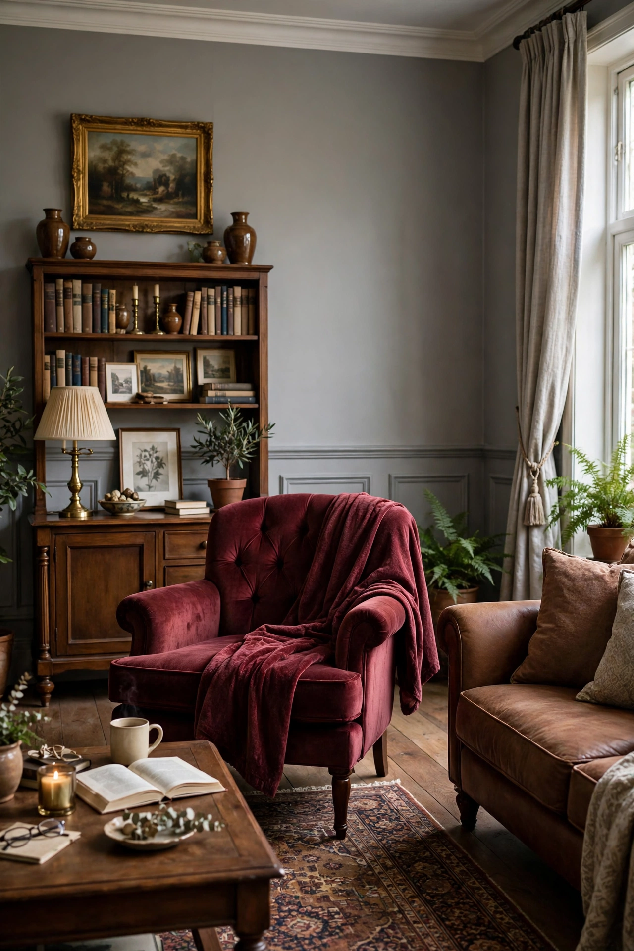
This palette adds burgundy to grey and brown. Burgundy is a deep red with a purple tone, so it brings richness without being loud. Use it in a throw, a velvet chair or curtains. The grey keeps the room balanced. It suits a formal or traditional living room.
Pro tip: Use burgundy in textured fabric, such as velvet, so the color has depth.
18. Warm grey, camel and ivory

This palette uses warm grey, camel and ivory. All three are soft, so the room feels calm and elegant. Camel is a light golden brown, and ivory adds a creamy glow. Use camel in the sofa or a leather chair and ivory in curtains and a rug. The result looks quiet and refined.
Pro tip: Mix textures like boucle, linen and wool, since a soft palette needs texture to stay interesting.
19. Grey and brown with black and white contrast
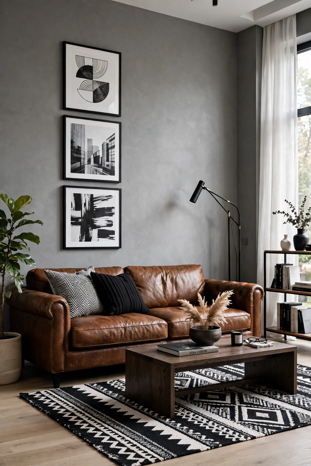
This palette adds black and white to grey and brown. White brightens the room, black adds contrast, and brown keeps it warm. Use black and white in art, frames and a rug, and brown in wood and leather. It looks crisp and modern. For more contrast looks, see these black and white living room ideas.
Pro tip: Keep black and white to small areas, such as frames and a rug, so brown stays the warm focus.
20. Grey, brown and soft mauve
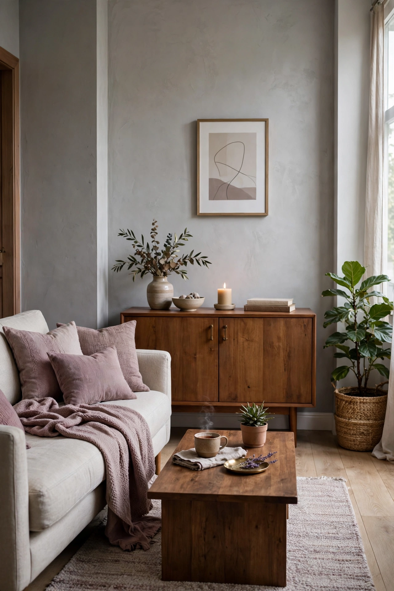
This palette adds soft mauve to grey and brown. Mauve is a muted purple-pink that feels warm and gentle. Use it in pillows, a throw or a curtain. It adds a subtle color that fits both main shades. The room feels soft, calm and a little unexpected.
Pro tip: Choose a mauve with a grey undertone, so it blends with the grey walls and does not look too pink.
Quick answers
What is the best brown and grey color combination for a living room?
Warm grey with chocolate or walnut brown and a cream accent is the safest. Cream bridges the two colors and keeps the room warm. Add black or sage for contrast.
What color goes with brown and grey?
Cream, white, black, sage green, navy, rust and dusty blue all work well with brown and grey. Choose one accent and use it in two or three small places.
How do I make a brown and grey room feel warm?
Use warm bulbs around 2700K, wood and leather textures, a wool rug and cream or camel accents. Choose greys with a warm undertone instead of blue ones.
What is the 60-30-10 rule?
It means 60 percent of a room is the main color, 30 percent a second color and 10 percent an accent. In this case, grey is 60, brown 30 and an accent 10.
Should walls be brown or grey?
Grey or greige walls are easier, since they reflect light and let brown furniture stand out. Brown walls work in larger or darker rooms with good lighting.
Does brown and grey look dated?
Not when you choose modern shades such as warm greige, walnut and black accents. Avoid heavy matching sets, and add texture so it feels fresh.
What wood tone goes best with grey?
Walnut, oak and mid-brown woods all suit grey. Warm woods balance cool greys, and one or two wood tones are enough.
How do I test a palette before painting?
Put paint samples on two walls and check them in the morning and evening. Place fabric swatches beside them, since light changes how grey and brown look.
Final thoughts
A good brown and grey palette comes down to balance. Pick one grey base, one or two browns and a small accent, then add warm lighting and texture. You do not need all 20 palettes. Choose one that matches your furniture and build from there. For more warm touches, these cozy living room ideas can help.
A warm palette makes a room feel like home.

Hi, I'm Wasif — welcome to The Homes Decors. I write about home decor: the ideas, choices, and small details that make a space feel considered rather than accidental. If you've ever wondered why a room works, not just what's in it, you're in the right place.