
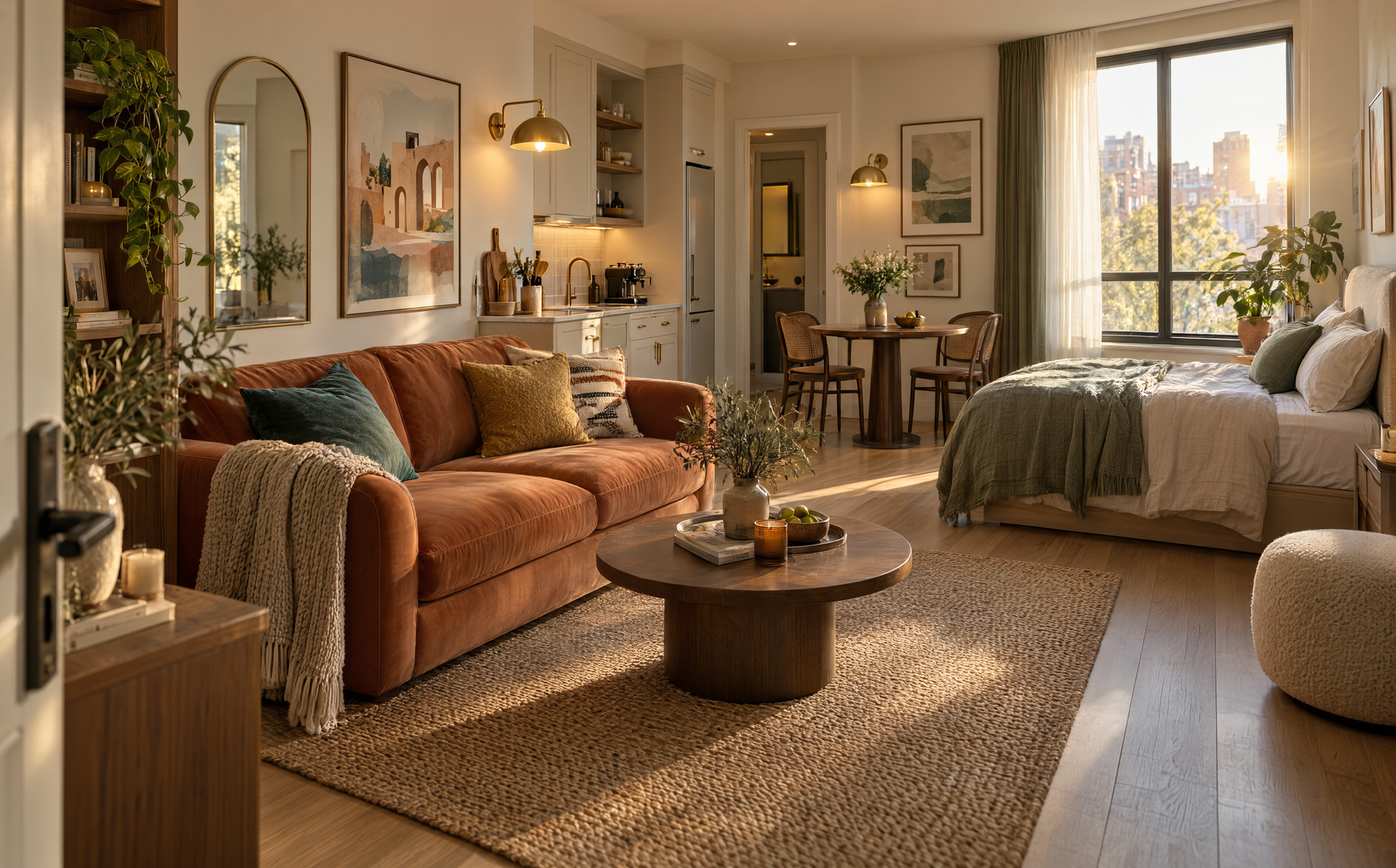
The best color palette for a studio is one anchor color, one neutral base, and one accent, repeated across the sofa, bedding, and curtains. When the bed, sofa, and dining table share one room, the palette sets the mood for the whole space, so every piece has to belong to it. Beige alone often reads flat, and a bold palette often works better than people expect.
Small rooms handle more color than most people think. What matters is that the colors work as a group, not that you like each shade alone. These 17 studio palettes include bold, soft, and minimal options, and each one comes with a tip you can use today. Pick the one that matches how you want to feel when you walk in.
1. Retro orange, green, and cream
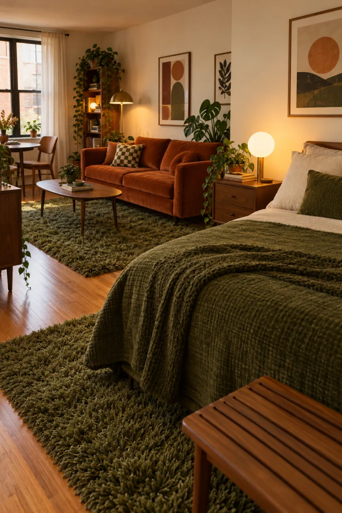
This palette works because the studio commits to it. A burnt orange velvet sofa, a shaggy green rug, and a matching green bedspread sit together under cream walls and warm lamp light. The result leans mid-century and playful. If your studio is a plain white box, this is a fast way to give it a personality. For more on using orange in a main seat, see these burnt orange sofa living room ideas.
Pro Tips: Keep walls cream and floors wood-toned, and limit the two saturated colors to the sofa, rug, and bedding so the room reads retro, not messy.
2. All-white monochrome

An all-white studio looks cold only when the textures match. Here, a marble TV backdrop, a plush ivory sectional, sheer linen curtains, and pale oak flooring all sit in the white family but feel different to the eye. Nothing competes, so the room reads quiet and open. In a small space, this palette is the easiest way to make the walls feel further away.
Pro Tips: Choose washable slipcovers or performance fabric before committing to white. A removable cover saves you from replacing the whole sofa after just one wine spill.
3. Cream and plum purple
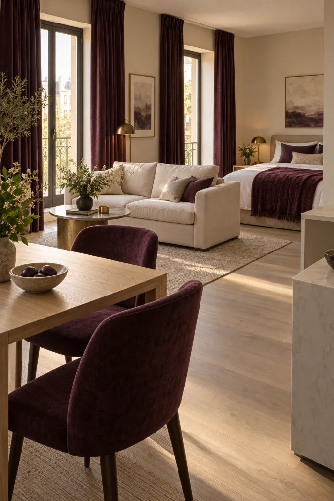
Plum is rarely used in small rooms, and it looks rich here. It appears in the curtains and dining chairs, repeats in a soft throw across the bed, and sits against a warm cream sofa and pale wood floors. The room feels grown-up without getting dark. For more purple pairings, see these purple living room ideas.
Pro Tips: Use plum in two places only, such as curtains and chairs, and keep the sofa cream. Too much purple looks heavy without a pale base.
4. Gray, turquoise, and lilac
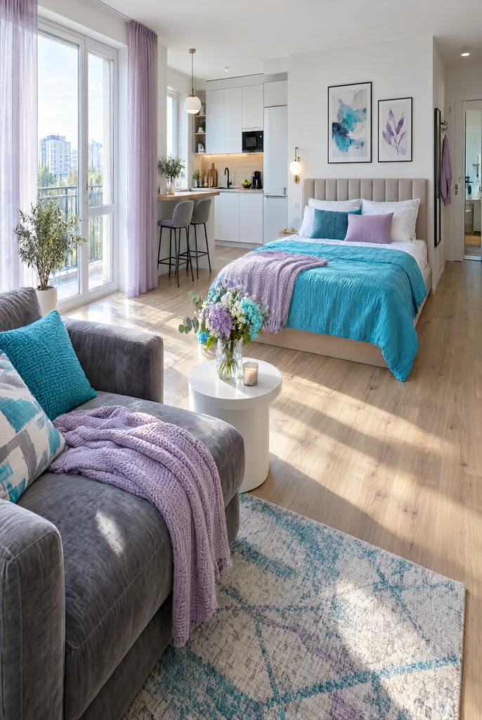
On paper this looks odd, and in the room it works. A gray velvet sofa, bright turquoise bedding, lilac sheer curtains, and warm blonde wood floors share one open space. Gray carries the large pieces and lets the turquoise stand out without a fight. If the studio has plenty of daylight, these cooler tones stay fresh from morning to evening.
Pro Tips: Always let gray take the biggest pieces and use bright turquoise only on the bedding. Lilac works best in sheer curtains, where light softens it.
5. Emerald green and mustard yellow
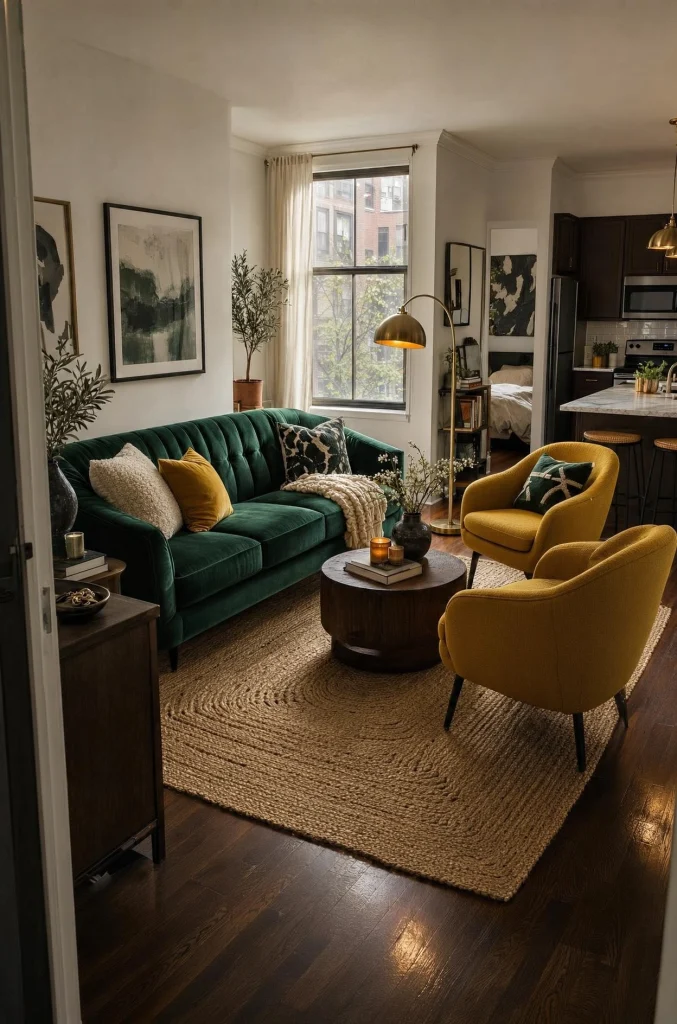
Emerald velvet beside mustard chairs gives a studio a rich, jewel-toned look. A dark wood floor anchors the colors, and a jute rug adds a rough texture that keeps them from feeling too sweet. The white walls stay plain on purpose, so the two strong colors get all the attention. The mood is warm and works well on rainy afternoons.
Pro Tips: Add one natural texture, like jute, linen, or unfinished wood, to any jewel-tone room. It adds warmth and keeps the saturated colors from looking polished.
6. Teal, beige, and white

If you want color but also calm, this palette sits in the middle. A teal sofa and matching teal bedspread give the room a clear identity, and beige curtains and pale wood floors quiet everything around them. White bar and coffee tables give the eye places to rest. It feels coastal without any theme items. For more teal ideas, see these teal living room ideas.
Pro Tips: Put your budget into the teal sofa, since it carries the room. Simple white tables and shelves let the color stand out and cost less.
7. Bold teal and mustard yellow

This is teal and yellow at full strength. Teal curtains and a teal sofa match each other, while mustard bedding and mustard cube shelves repeat the second color across the room. The repetition is what makes it feel planned. If you are tired of being told to keep a small studio safe, this palette gives you a reason to go bold.
Pro Tips: Repeat each color at least three times around the room. One teal pillow and just one yellow lamp looks accidental, not designed.
8. Terracotta, chocolate brown, and rust
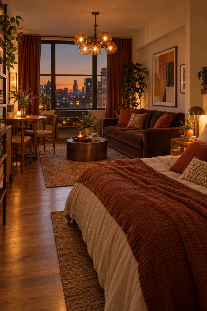
This palette feels like autumn inside a studio. A chocolate velvet sofa, burnt orange curtains, terracotta pillows, and a honey wood floor make the room feel warm and slow. A globe chandelier throws amber light that flatters every warm surface. It suits north-facing studios that get cold light. For more brown sofa ideas, see these chocolate brown sofa living room ideas.
Pro Tips: Always choose pumpkin, rust, or cinnamon pillows instead of beige, and use warm amber bulbs. Beige next to chocolate brown looks washed out and flat.
9. Lavender walls and charcoal gray

Painting a studio lavender takes some nerve, and it changes the whole room. Soft lilac walls give the space a quiet warmth, and a deep gray sectional keeps the color from feeling sugary. A dark wood coffee table adds weight to the low furniture. The palette feels like a spring morning and stays easy to live with.
Pro Tips: If you rent, use lavender in curtains, bedding, and art instead of paint. If you plan to stay, paint the walls. Test a swatch first.
10. Forest green and sunny yellow
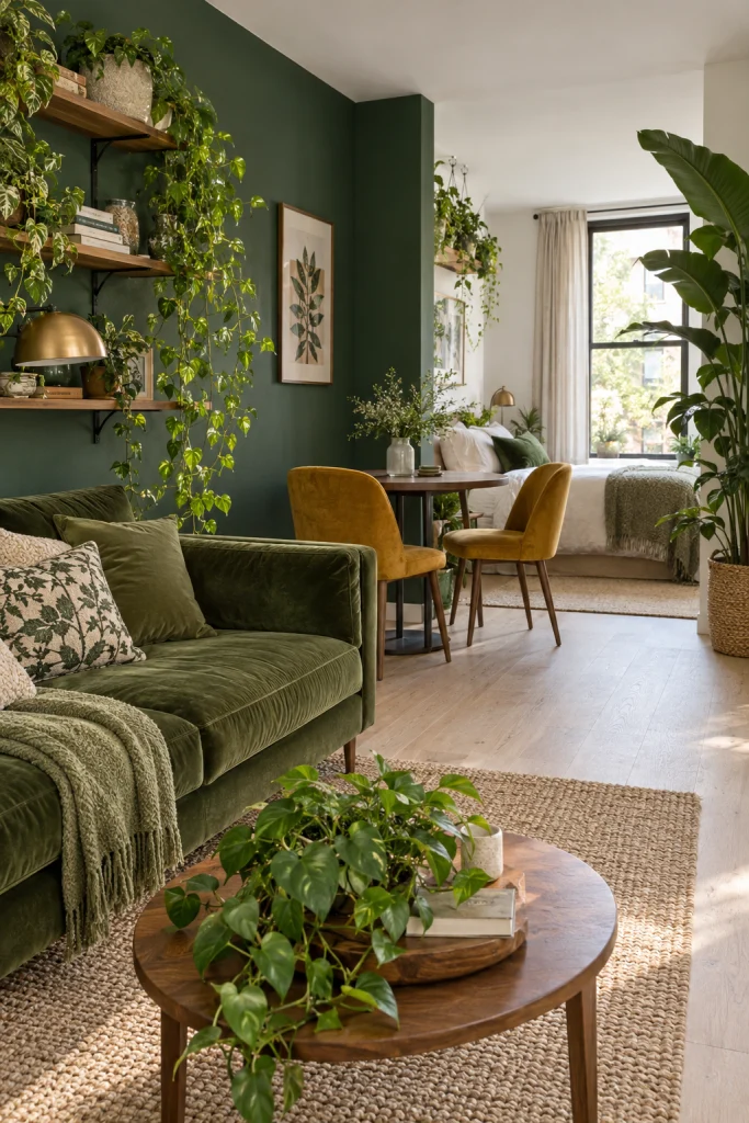
A forest green feature wall, mustard dining chairs, and an olive velvet sofa give this studio a greenhouse feel. Plants trailing on shelves and standing in corners support the palette without extra decor. A white ceiling and pale floor stop the green from closing in the room. It suits anyone who wants a small garden apartment feel. For more deep green ideas, see these dark green living room ideas.
Pro Tips: Paint only one wall deep green and leave the other three light. Four dark walls close in a small studio, while one wall adds depth.
11. Soft lilac, gray, and a yellow pop
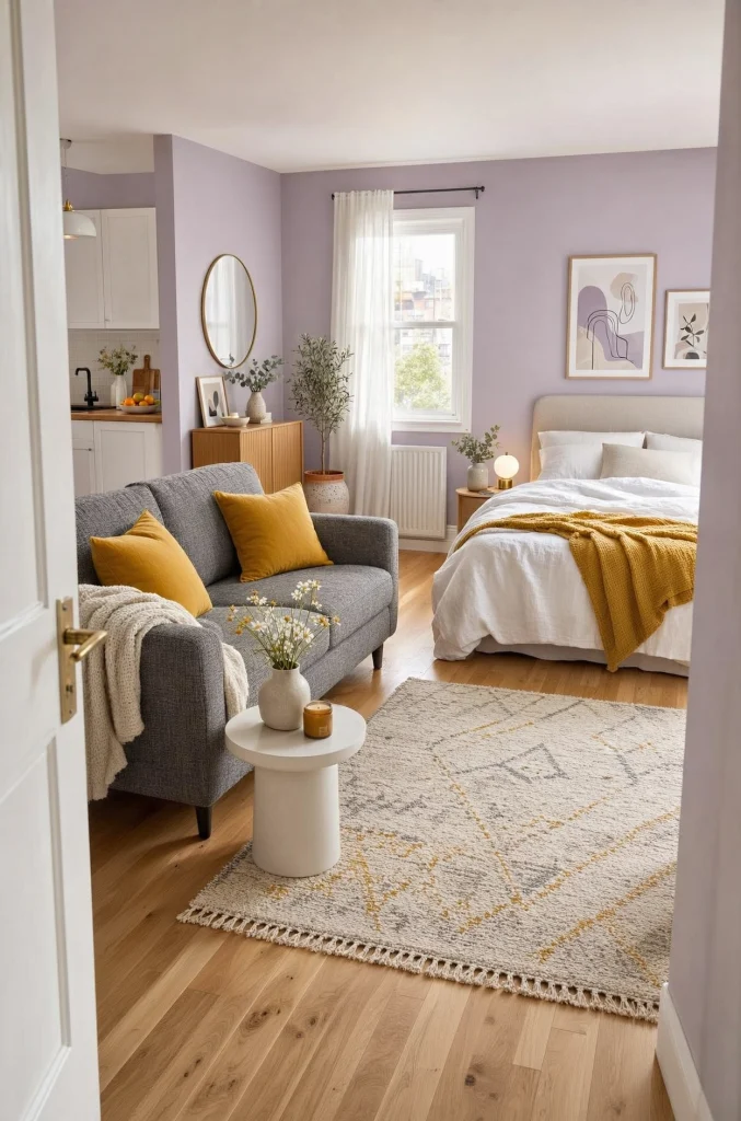
This is the calmer version of the palette above. Pale lilac walls, a gray tweed sofa, and white bedding set the base, and two mustard yellow pillows act as the single accent. Without the yellow, the room drifts toward flat and forgettable. Warm honey floors give it a foundation. It lifts studios with small windows.
Pro Tips: Use exactly two yellow pillows and nothing else yellow. A small, clear accent keeps the lilac and gray from looking flat without adding extra clutter.
12. Crisp white and a vintage red rug
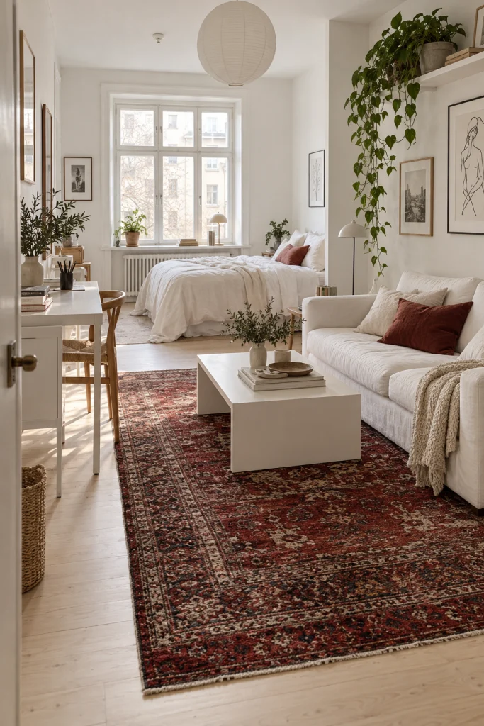
This is a Scandinavian studio done well. The sofa, bedding, walls, coffee table, and desk are nearly all white, but a deep red vintage Persian rug changes the temperature of the room. It adds age and warmth without adding clutter. Framed line drawings and trailing plants keep the white from feeling clinical. For help picking the right color, see this guide on how to pick the right rug color for your studio apartment.
Pro Tips: Check local resale listings and estate sales for a worn red rug, and measure your floor first so the size fits the whole seating area.
13. Neutral beige with jewel pillow pops
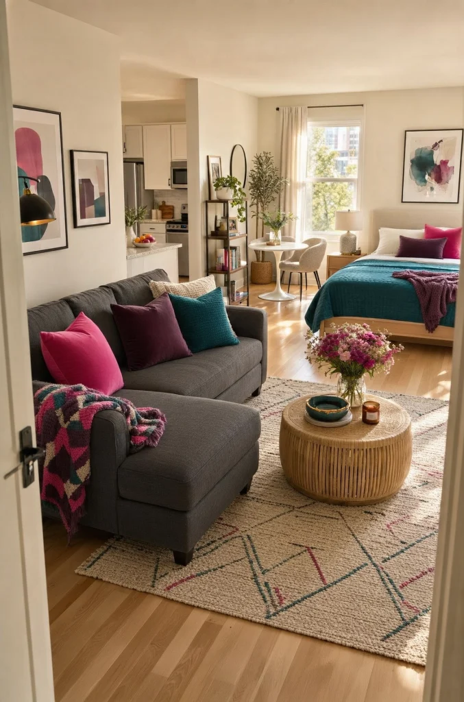
If you cannot commit to a bold palette but still want personality, this is the compromise. Warm cream walls, a charcoal gray sofa, and blonde wood floors form the base. Hot pink, plum, and teal pillows sit on the sofa, and a teal bedspread repeats across the room. The pillows carry the personality, and you can swap them each season.
Pro Tips: Buy pillow inserts once and swap covers each season. Covers cost far less than new pillows and change the mood of the whole studio fast.
14. Blush pink, cream, and blonde wood

Blush pink is often dismissed as too sweet, and this palette shows how restrained it can be. Dusty pink curtains, cream upholstery with a single pink pillow, and pale oak flooring feel romantic without looking fussy. A gray throw and a warm textured rug keep it grounded. For more soft pink pairings, see these pink and beige living room ideas.
Pro Tips: Spend on the curtains, since they cover the most pink in the room. Cheap blush fabric looks shiny, so check it in daylight before buying.
15. Peacock teal, mustard, and sage
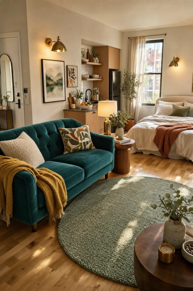
This palette uses three colors instead of two. A peacock teal velvet sofa, a mustard throw, a sage green round rug, and brass wall sconces glow against pale walls. Each color appears in a different material: velvet, wool, jute, and metal. Because no two items compete, the room looks collected instead of crowded.
Pro Tips: Place the three colors in a triangle across the room, such as sofa, rug, and throw, so your eye moves around easily instead of stopping.
16. Muted teal, warm beige, and jute

Think of this as the quieter, more adult version of the bold teal palettes above. A muted teal sofa, soft beige curtains, and a jute rug sit together, and the bed is dressed in cream and dusty sage. The palette is coastal without being beachy and works in almost any light, which helps if the studio faces north.
Pro Tips: Mix three different pillows from different shops in your palette. Slight differences look collected, while a matching set of four looks like a hotel room.
17. Mid-century mustard, teal, and walnut
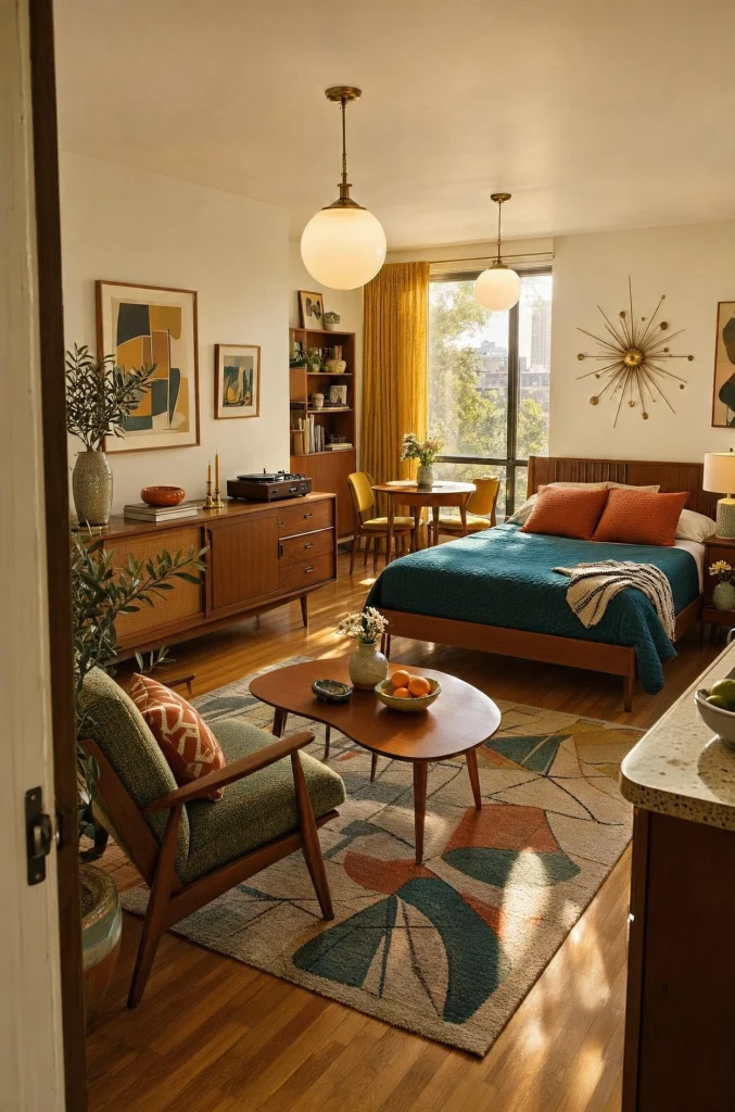
Mid-century design suits small spaces well. Rich walnut furniture, mustard yellow curtains, a teal bedspread, and rust-orange accent pillows all draw from the same 1960s style. A starburst wall decal and globe pendants finish the look. If you own vintage furniture or want a reason to start collecting, this palette gives each piece a place.
Pro Tips: Choose the wood first, in walnut, teak, or oak, and keep it in one tone. Then pull mustard, teal, and rust from fabrics around it.
FAQs
What color palette makes a studio feel cozy?
Warm palettes such as terracotta, chocolate brown, cream, and mustard with wood tones feel cozy fastest. Add warm 2700K bulbs to bring out the warmth.
How many colors should a studio palette have?
Use two to three: one neutral base, one anchor color, and one accent. More than three colors in one room starts to look busy.
Can I use dark colors in a small studio?
Yes. Use a dark color on one wall or on the sofa, and keep the ceiling and floor light so the room stays open.
How do I add color to a studio without painting?
Use curtains, bedding, a rug, and pillows. These textiles change the palette in a weekend and come with you when you move.
Which palette works best for a north-facing studio?
Warm palettes like terracotta, cream, mustard, and warm wood work best. Cool grays can feel colder in the weaker light.
Final Thoughts
The right palette for your studio is the one that matches how you want to feel when you walk through the door, not the one that is trending. If you want calm, go monochrome. If you want energy, go bold. If you cannot decide, hold off on paint and let textiles carry the color, since curtains, bedding, and pillows change in a weekend.
Waiting for a perfect palette keeps the room unfinished. Pick one from this list, live with it for a few weeks, and adjust one piece at a time. A studio does not need to be white to feel safe. Choose colors you will still like in a year.

Hi, I'm Wasif — welcome to The Homes Decors. I write about home decor: the ideas, choices, and small details that make a space feel considered rather than accidental. If you've ever wondered why a room works, not just what's in it, you're in the right place.