
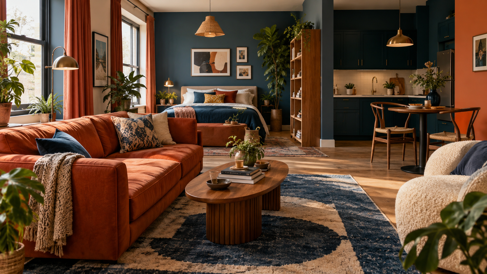
Color does more for a studio than any furniture upgrade, and it costs almost nothing to change. The right palette makes 400 square feet feel open and intentional; the wrong one shrinks the room and clashes with everything already in it. Here are 13 color schemes that prove a small space can have big personality.
Quick reference: which palette fits your studio
| Scheme | Best for | Anchor tones |
|---|---|---|
| Lime green + charcoal | Bold, playful studios | Lime, charcoal, rainbow accent |
| Golden yellow + lavender | Warm, cozy contrast | Gold, lavender, warm wood |
| Lilac + turquoise | Bright, youthful spaces | Lilac, turquoise, white |
| Slate gray + burnt orange | Graphic, confident studios | Gray, burnt orange, mustard |
| Sage green + cream | Making a studio feel bigger | Sage, cream, gold accents |
| Citrus green + mustard | Garden-like, lively rooms | Lime green, mustard, white brick |
| Forest green + olive | A layered, nature-inspired feel | Forest, olive, sage |
| Warm greige + cognac | Quiet, designer-level sophistication | Greige, cognac, blush |
| Terracotta + beige | Warm with a modern edge | Terracotta, beige, white |
| Coastal blue + driftwood | Relaxed, beach-house calm | Blue, brown, gray |
| Teal + white + gold | An expensive-looking contrast | Teal, white, gold |
| Lavender + hot pink | Bold, maximalist personality | Lavender, hot pink, purple |
| All-white + teal pop | Restraint over bold choices | White, single teal accent |
Before committing to any of these, it helps to lock in a cozy color palette for your studio apartment as a starting framework, since most of the schemes below build on the same core rule of one dominant tone plus one contrast.
1. Lime Green and Charcoal with Rainbow Accents
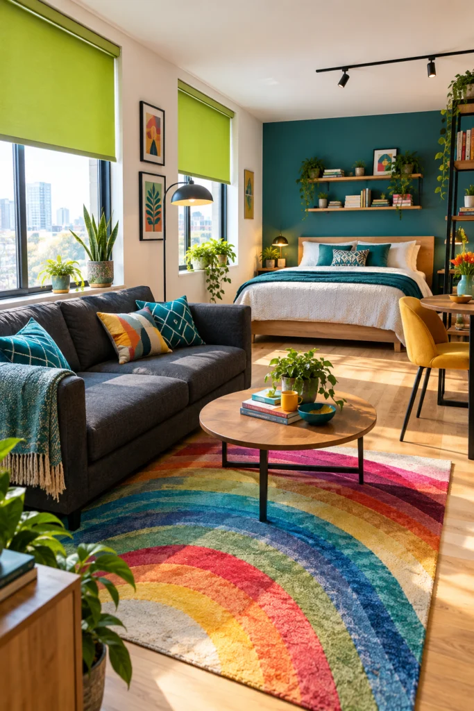
This palette is fearless and it works — lime green roller blinds flood the space with energy while a charcoal sofa grounds everything so it doesn’t tip into chaos. A rainbow rug becomes the conversation starter against the wood floors, and teal and geometric pillows tie the two main colors together.
Pro tip: When you go bold on the floor, keep the walls white and let the furniture do the talking.
2. Golden Yellow and Lavender with Warm Wood
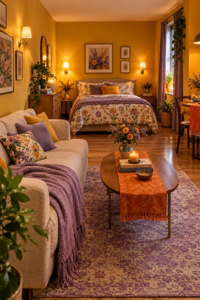
Golden walls under warm sconce lighting make this studio feel like a permanent sunset, while a lavender throw and rug add a cool contrast that keeps the warmth from feeling heavy. Floral bedding bridges both tones, and an orange table runner adds one more warm layer without competing.
3. Lilac and Turquoise on a Bright White Base
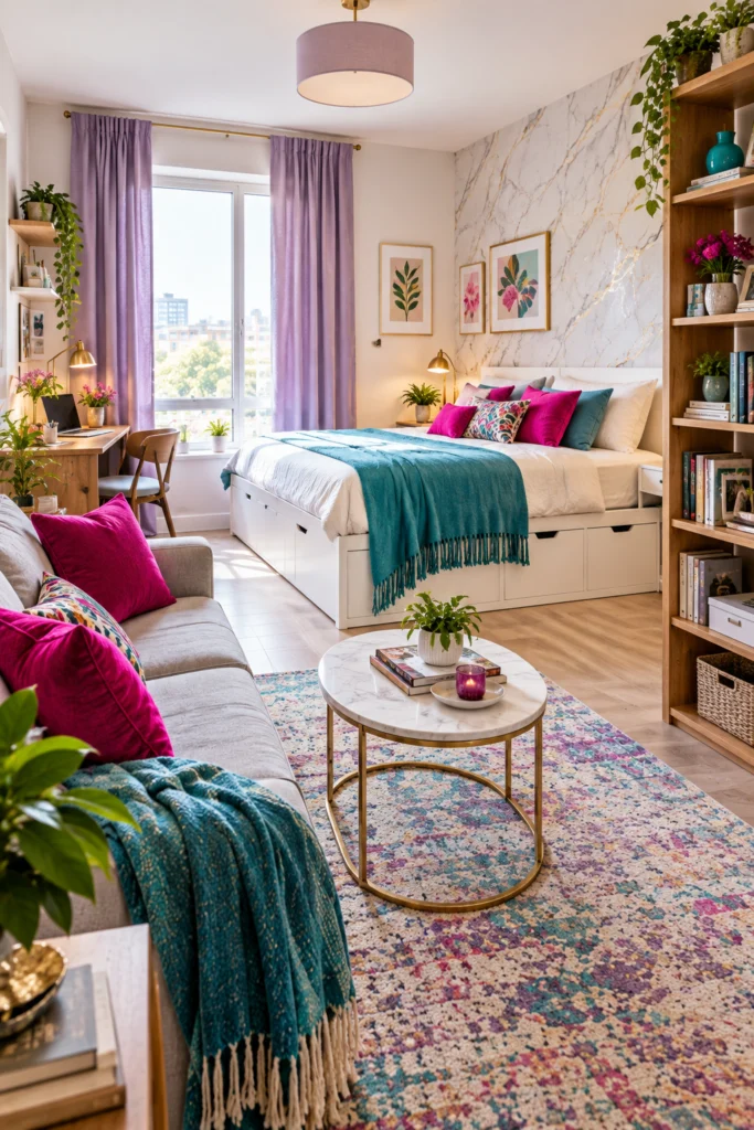
Pastels aren’t just for nurseries — lilac curtains paired with a turquoise throw create a fresh, modern contrast against a white storage bed and marble-effect accent wall. A wooden desk and bookshelf add warmth so the room doesn’t tip sterile, and fuchsia cushions echo the curtain tone. For more on getting that storage-and-shelving mix right, see mini studio apartment shelving ideas.
4. Slate Gray and Burnt Orange with Pop Art Energy
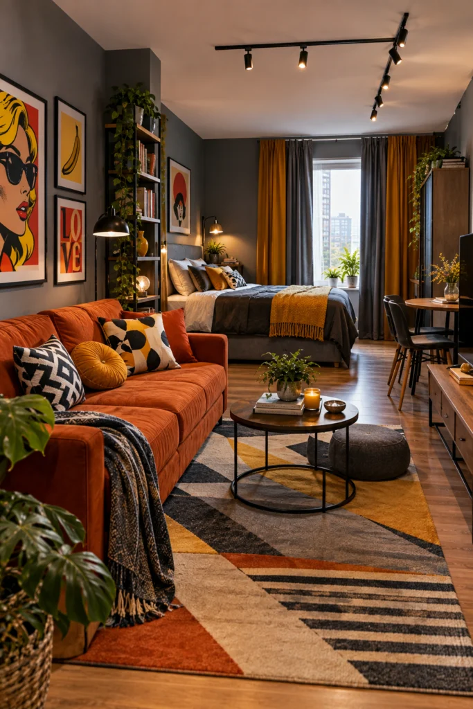
Gray walls make the perfect canvas for a statement sofa, and this burnt orange piece delivers on that. Pop art prints add graphic punch without needing a full gallery wall, while mustard-and-gray curtains pull the warm and cool tones together and black track lighting gives the space an industrial edge.
5. Sage Green and Cream with Vintage Charm
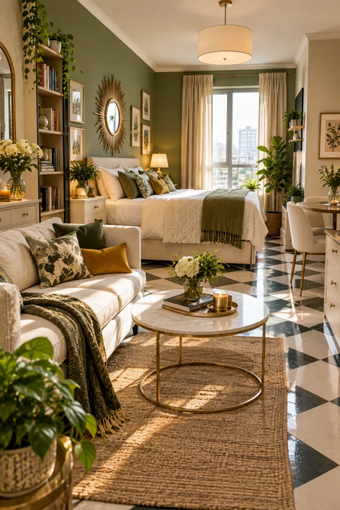
Sage green and cream is the combination that makes a studio feel nearly twice its size — a green accent wall adds depth without heaviness while cream furniture and bedding keep the rest light. A gold sunburst mirror bounces light around the room, and a checkerboard floor adds character without overwhelming the palette.
6. Citrus Green and Mustard with White Brick
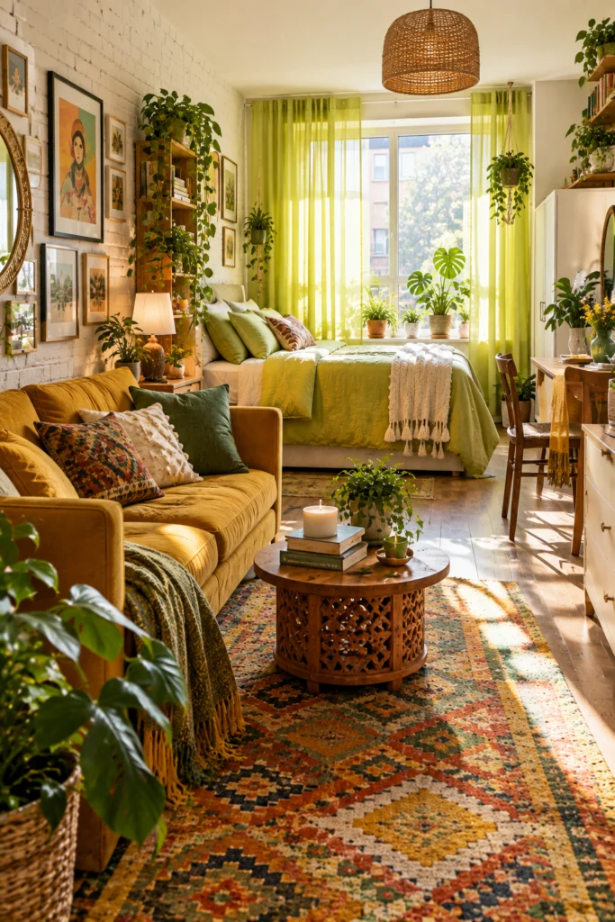
This palette leans fully into lush, garden-like energy — lime green bedding and sheer green curtains pair with a mustard sofa for warm contrast, while a white brick wall keeps things grounded. Plants throughout reinforce the natural vibe, and a Moroccan-style rug ties every color together.
7. Forest Green and Olive with Botanical Accents
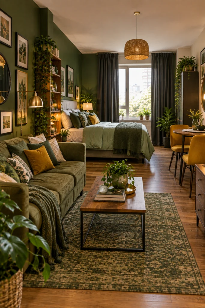
Going tonal with green — deep forest on the accent wall, olive on the sofa, sage on the bedding — creates a layered, nature-inspired cocoon. Dark charcoal curtains frame the window without competing, and mustard dining chairs add just enough contrast to keep the palette from reading as one-note. For more ways to build a palette this deliberately, see pick a cozy color palette for your studio apartment.
8. Warm Greige and Cognac with Blush Accents
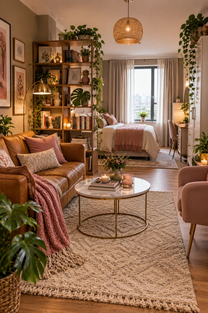
This is the palette interior designers keep returning to — warm greige walls let cognac leather and blush pink feel sophisticated without trying too hard. A bookshelf doubles as a room divider here, keeping zones distinct while the space stays open, and a cream textured rug and trailing monstera add softness. For more on that exact divider approach, see studio apartment layout ideas using bookshelf room dividers.
9. Terracotta and Beige with a Modern Edge
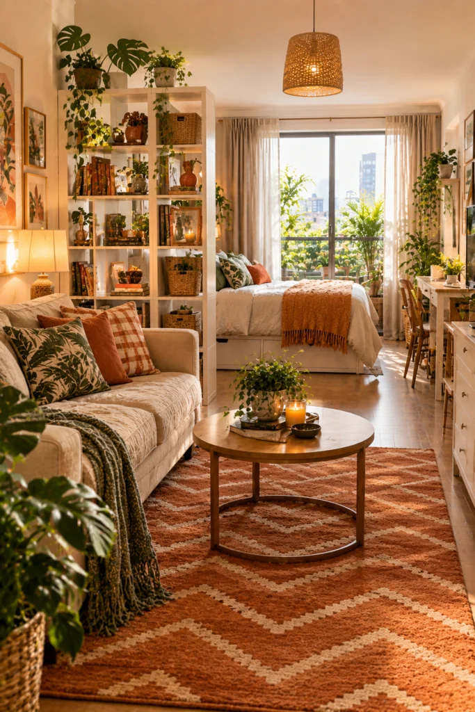
A bold terracotta chevron rug anchors this studio with warmth while a beige sofa and white walls keep everything around it calm. A cube bookshelf does double duty as a room divider, and plaid and tropical pillows add texture without clutter.
Pro tip: When the rug is the statement piece, keep everything else neutral and let it breathe.
10. Coastal Blue and Driftwood Brown
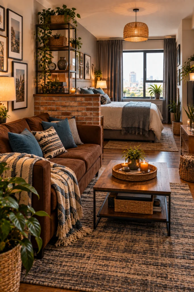
Blue and brown together hit a relaxed coastal note without tipping into kitsch — a chocolate suede sofa feels warm while cerulean pillows and a striped throw pull in ocean blues. A half-wall with an exposed brick backdrop separates the sleeping area without blocking light, and woven baskets reinforce the beach-house feel.
11. Teal and White with Gold Accents
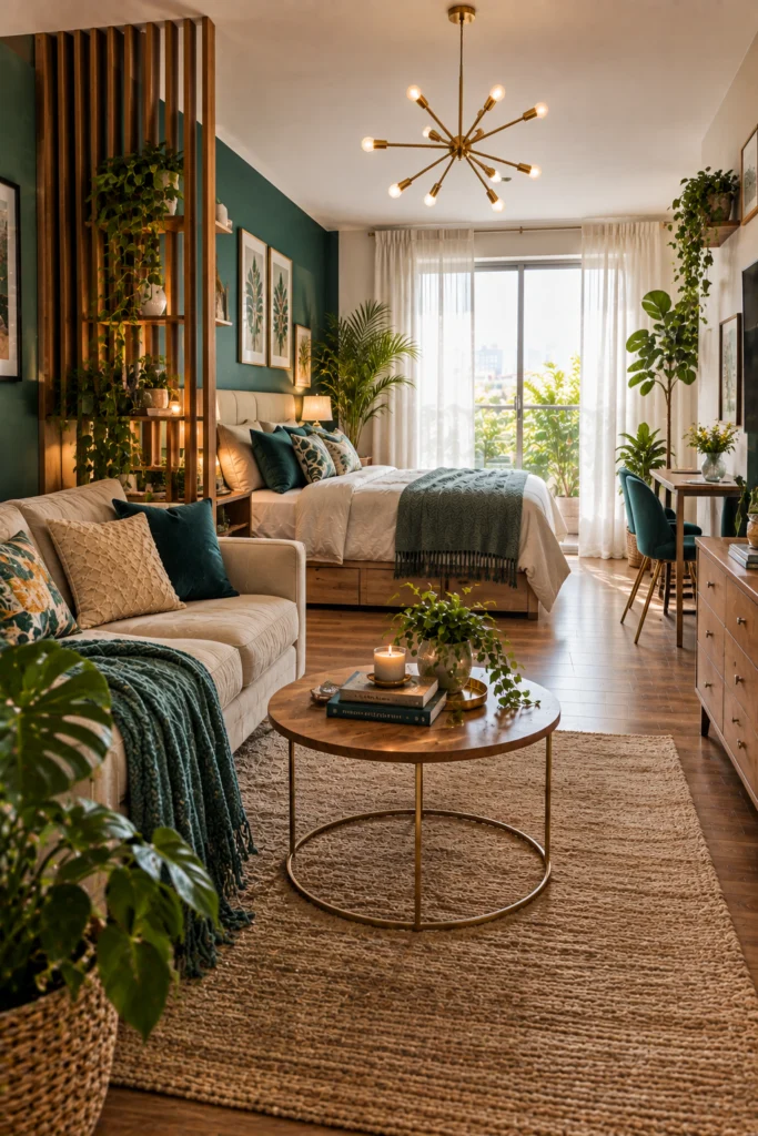
Teal against crisp white looks expensive even when it isn’t — a teal accent wall behind the bed creates a dramatic focal point while a wood slat divider separates the sleeping area with warmth and texture. A gold sputnik chandelier becomes the statement piece the room revolves around, and sheer white curtains keep daylight soft. For more on that kind of accent wall treatment, see studio apartment ideas with brick walls.
12. Lavender and Hot Pink with Retro Flair
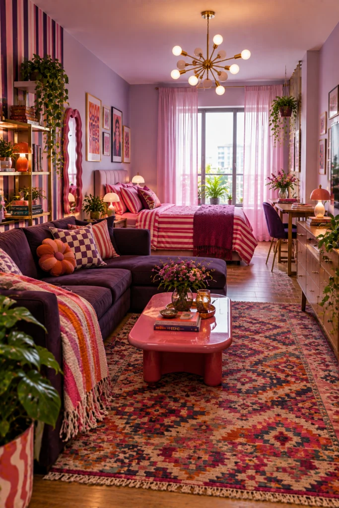
This palette isn’t for the timid, and that’s exactly why it works — lavender walls paired with pink sheer curtains and hot pink striped bedding make an unapologetically bold statement. A deep purple sectional anchors the living zone while a striped accent wallpaper adds visual rhythm, and kilim rugs bring in warmth.
13. All-White with Teal Pops and Glass Partitions
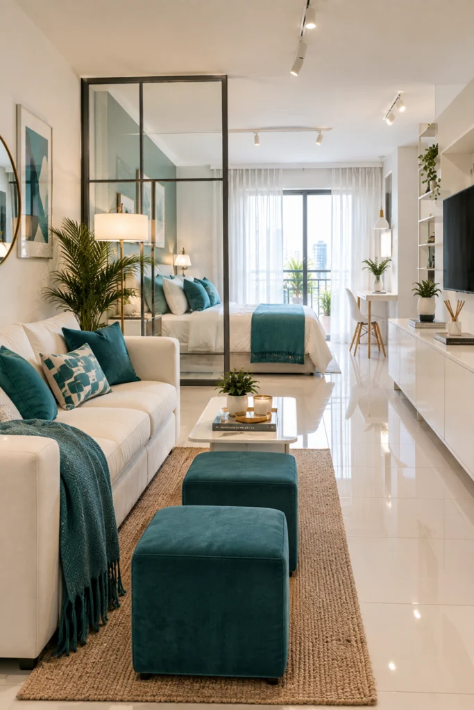
When in doubt, go all-white and add one accent color — this studio proves restraint can be as powerful as going bold. Teal cube ottomans and pillows are the only color, popping against a white sofa, console, and tile floor, and a glass partition wall separates the bedroom without stealing a single inch of light.
Common studio color scheme mistakes
- Choosing more than two anchor colors. One dominant tone plus one contrast color reads as intentional; three or more competing colors reads as indecisive.
- Skipping a neutral base under a bold palette. Even the boldest schemes here rely on white, cream, or beige somewhere to keep the bold colors from overwhelming the room.
- Matching furniture and walls in slightly different shades by accident. A near-miss in undertone looks like a mistake; go fully matching or clearly contrasting instead.
Quick answers
How many colors should a studio apartment color scheme have?
Usually two main colors plus a neutral base — one dominant tone, one contrast, and white, cream, or beige to keep the palette from feeling overwhelming.
Is an all-white studio too plain?
Not if it includes one accent color, like teal or terracotta, repeated in a few spots — the restraint reads as intentional rather than unfinished.
What color scheme makes a studio look bigger?
Sage green and cream, or any palette that stays in one tonal family, tends to make a small room feel more spacious than a high-contrast palette.
Can bold colors work in a small studio apartment?
Yes, as long as the palette sticks to two or three colors and a neutral base carries the rest of the room, bold color doesn’t shrink the space.
Do curtains or walls matter more for a color scheme?
Curtains are usually the easier and cheaper place to commit to color first, since they can be swapped without repainting if the scheme doesn’t work out.
What’s a renter-friendly way to add a bold accent wall color?
Removable wallpaper or a large fabric panel gives the same visual impact as paint without needing landlord approval or a repaint before moving out.
Should the bedroom and living area share the same color palette in a studio?
Yes, generally — carrying the same two or three anchor colors through both zones is what keeps an open studio feeling like one room instead of two mismatched ones.